

What these settings control
- The space between cards side by side (column gap).
- The space between rows of cards (row gap).
- Grids on collection, search and blog pages, and in sections such as Featured collection, Features, Mosaic, Bundle and related products.
How to access
1
Open the Theme Customizer
In your Shopify admin, open Online Store, then Themes, and click Customize next to Facet.
2
Open Theme settings
Click the Theme settings icon in the left sidebar.
3
Open Grid
Expand Grid. Open a collection page in the preview to see the gaps change as you drag.

Grid settings
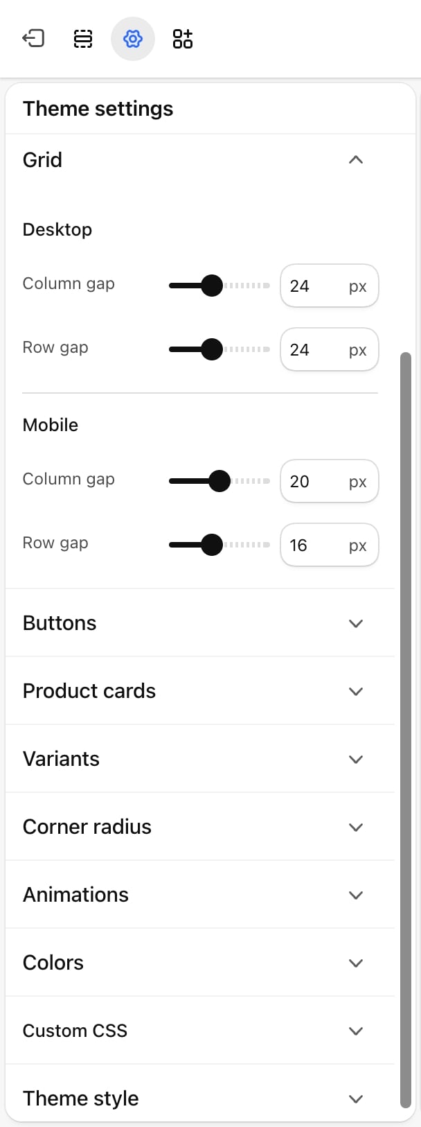
Desktop
Used on screens 750 pixels wide and wider.- Column gap: from 0 to 60 pixels. Default: 24.
- Row gap: from 0 to 60 pixels. Default: 24.
Mobile
Used on screens narrower than 750 pixels.- Column gap: from 0 to 40 pixels. Default: 20.
- Row gap: from 0 to 40 pixels. Default: 16.
A row gap of 0 makes rows of cards touch. With Show card borders on in Product cards, the borders of neighboring cards then meet.
Best practices
- Keep the row gap close to the column gap. Even spacing makes a grid read as one block. Product cards already leave space under their text, so a slightly smaller row gap often looks even.
- Use small gaps on phones. Phones show two cards side by side, and a large gap makes the pictures noticeably smaller.
- Try 0 for an editorial look. A zero column gap with borderless cards makes pictures run together like a contact sheet.
Related guides
Product cards
Set the picture shape and borders of the cards in the grid.
Layout
Set the page width the grid fills.