

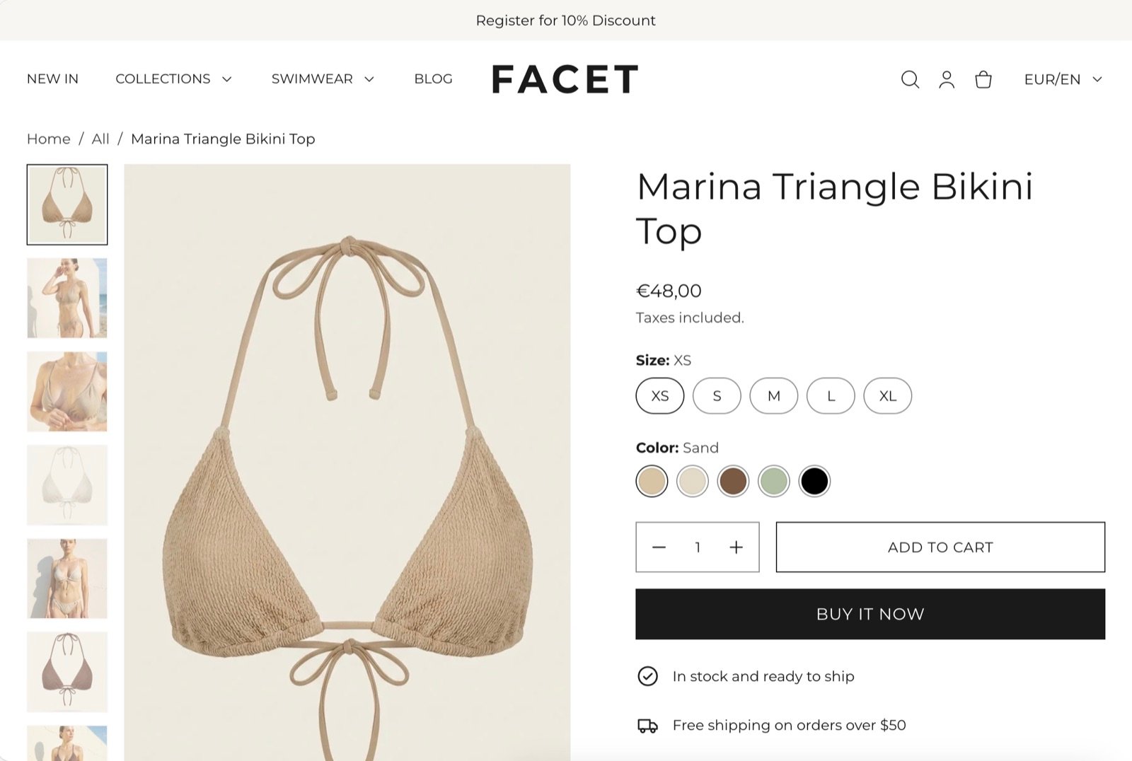
What this section controls
- The picture gallery: carousel, grid or stacked layout, thumbnails, arrows and picture shape.
- Full-screen zoom on the product pictures.
- The breadcrumb trail above the product.
- The sticky add to cart bar that appears once shoppers scroll past the buy buttons.
- The blocks in the product column: title, price, variant picker, buy buttons, pickup, collapsible rows, sharing and more.
Getting started
1
Open the Theme Customizer
In your Shopify admin, open Online Store, then Themes, and click Customize next to Facet.
2
Open the product template
In the template picker at the top of the Theme Customizer, choose Products, then Default product. The preview shows one of your products.
3
Set up the gallery
Click Product in the Sections panel to choose the gallery layout, thumbnails and picture shape.
4
Arrange the product blocks
Under Product, drag blocks to reorder them, or click Add block to add one, such as Collapsible row or Share.
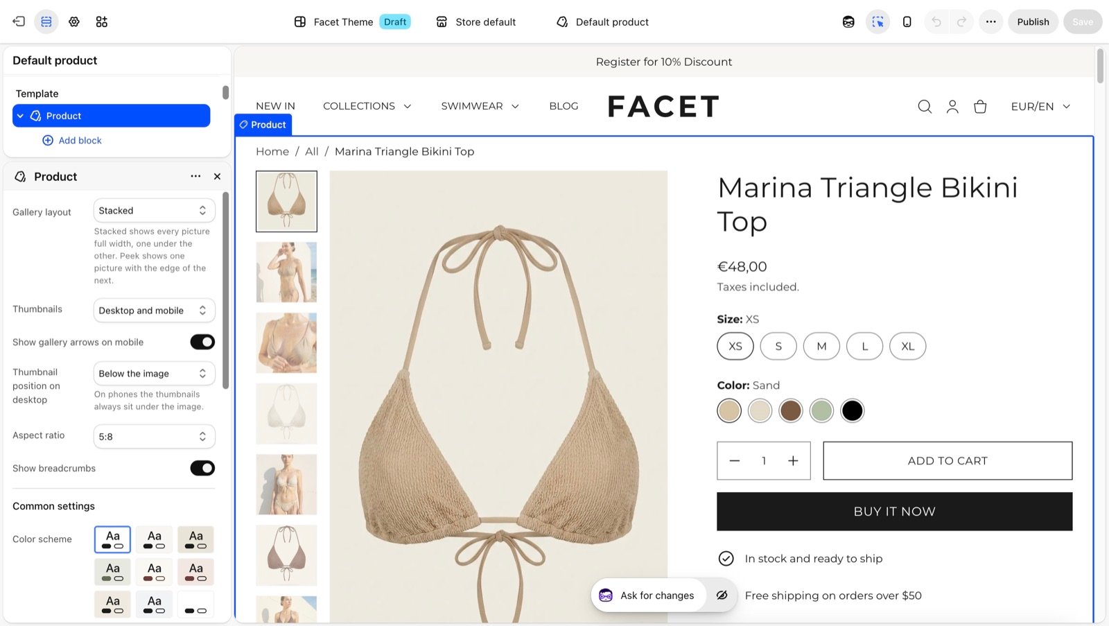
Changes to the default product template apply to every product that uses it. The product’s own content, such as its title, pictures, price and description, is edited in your Shopify admin under Products.
Section settings
Gallery
Gallery layout
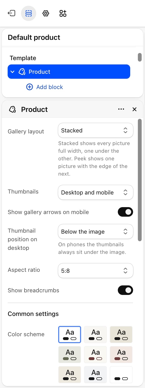
Gallery layout
- Carousel (default): one picture at a time, with arrows and a progress bar.
- Carousel with next picture peeking: one picture with the edge of the next one showing.
- Grid: every picture shown at once, in rows.
- Stacked: every picture full width, one under the other.
Images per row on desktop
Images per row on desktop
1 or 2 (default). Phones always show one picture per row. Appears only when Gallery layout is Grid.
Thumbnails
Thumbnails
Hidden, Desktop only, Mobile only or Desktop and mobile (default). Thumbnails only show when the product has more than one picture or video. Videos get a small play badge.
Thumbnail position on desktop
Thumbnail position on desktop
Below the image (default) or Beside the image. On phones the thumbnails always sit under the picture. Appears only when Thumbnails shows them on desktop.
Aspect ratio
Aspect ratio
The shape of the gallery pictures: 5:8 (default), 2:3, 3:4, 4:5, 1:1, 4:3 or 16:9.
- Show gallery arrows on mobile: on by default. Shows previous and next arrows on the carousel on phones.
- Show breadcrumbs: on by default. Shows a trail above the product: Home, the first collection the product belongs to, then the product.
Zoom
Zoom has no setting. A zoom button on the gallery, or a click on a picture in the grid and stacked layouts, opens the pictures full screen. Shoppers move between pictures with the arrows or the arrow keys, and close the view with the close button or a click outside the picture.Sticky add to cart
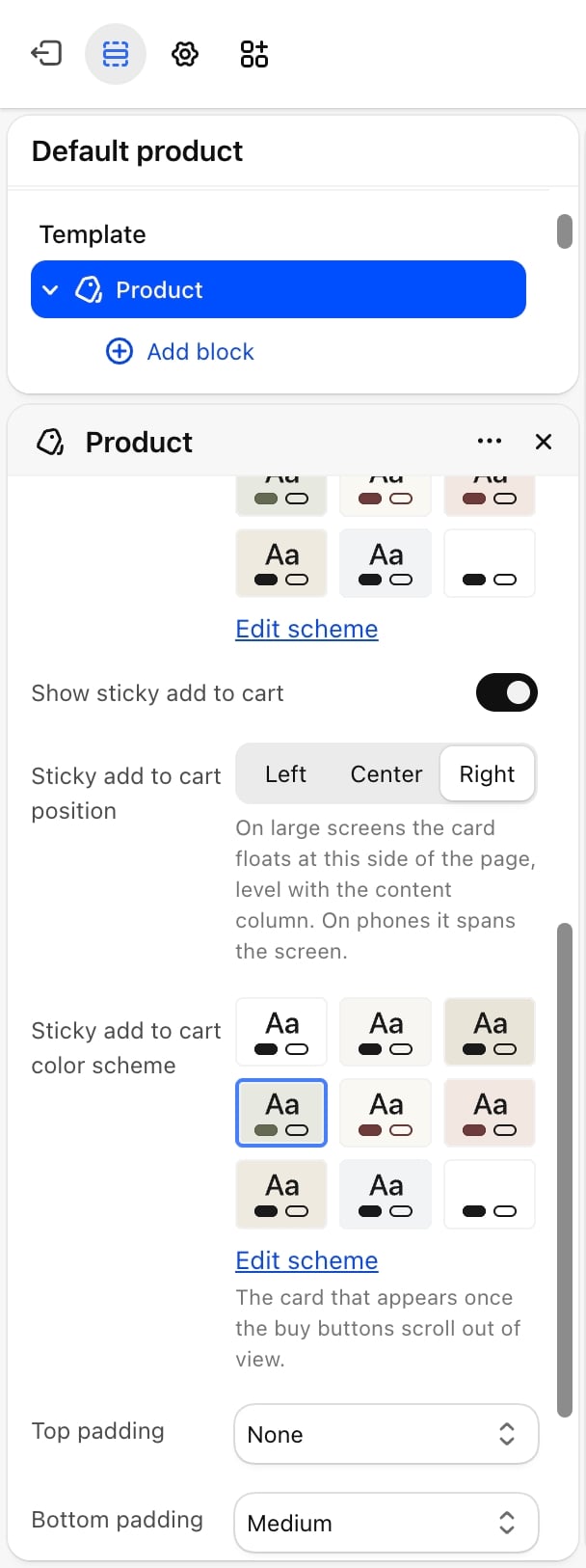
- Show sticky add to cart: on by default. Once the buy buttons scroll out of view, a card appears with the product picture, title, chosen variant, price and an Add to cart button. Its Change button scrolls back to the gallery so shoppers can pick another variant.
- Sticky add to cart position: Left, Center or Right (default). On large screens the card floats at this side of the page. On phones it spans the screen. Appears only when Show sticky add to cart is on.
- Sticky add to cart color scheme: the colors of the card. Appears only when Show sticky add to cart is on.
Common settings
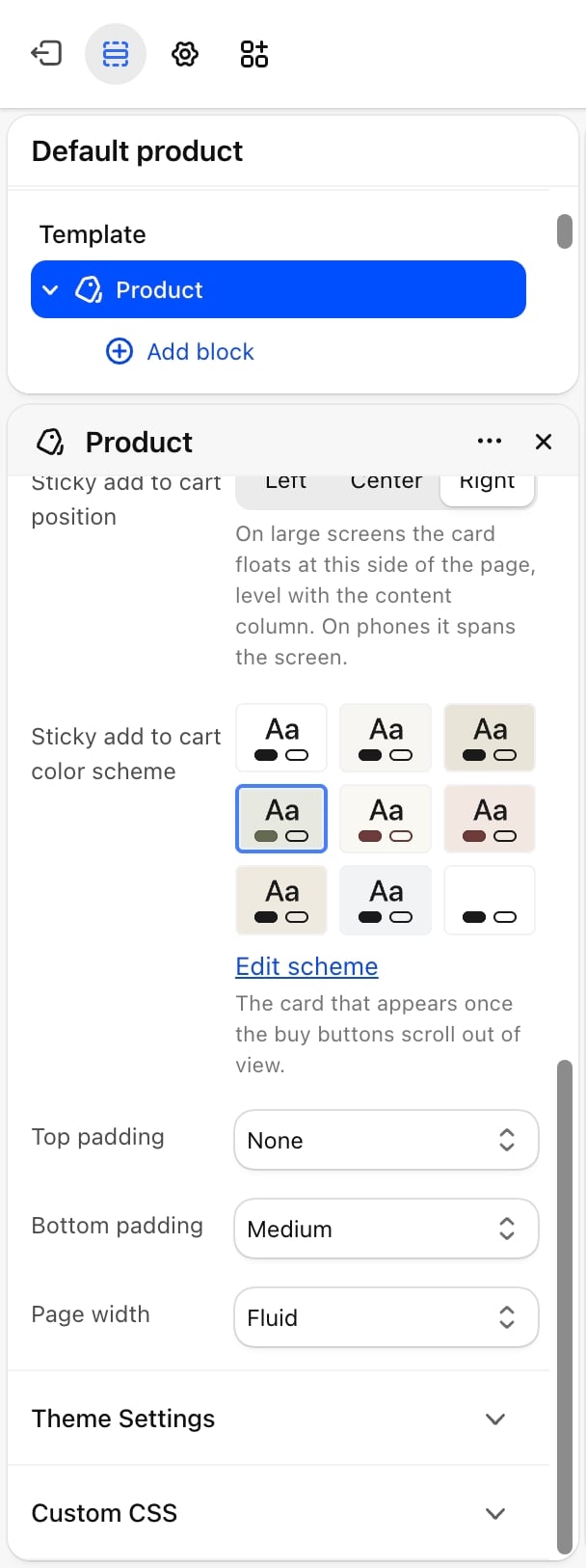
- Color scheme: the colors of the section.
- Top padding: None (default), Small, Medium, Large or Extra large.
- Bottom padding: None, Small, Medium (default), Large or Extra large.
- Page width: Narrow, Narrower, Fluid (default) or Full.
Blocks
Each block below can be added once, unless it says otherwise. Every block also has a Bottom padding setting for the space under it: None, Extra small, Small, Medium (default) or Large.Vendor
Shows the product’s vendor, as set on the product in your Shopify admin. No other settings.Heading
Shows the product title as the page heading.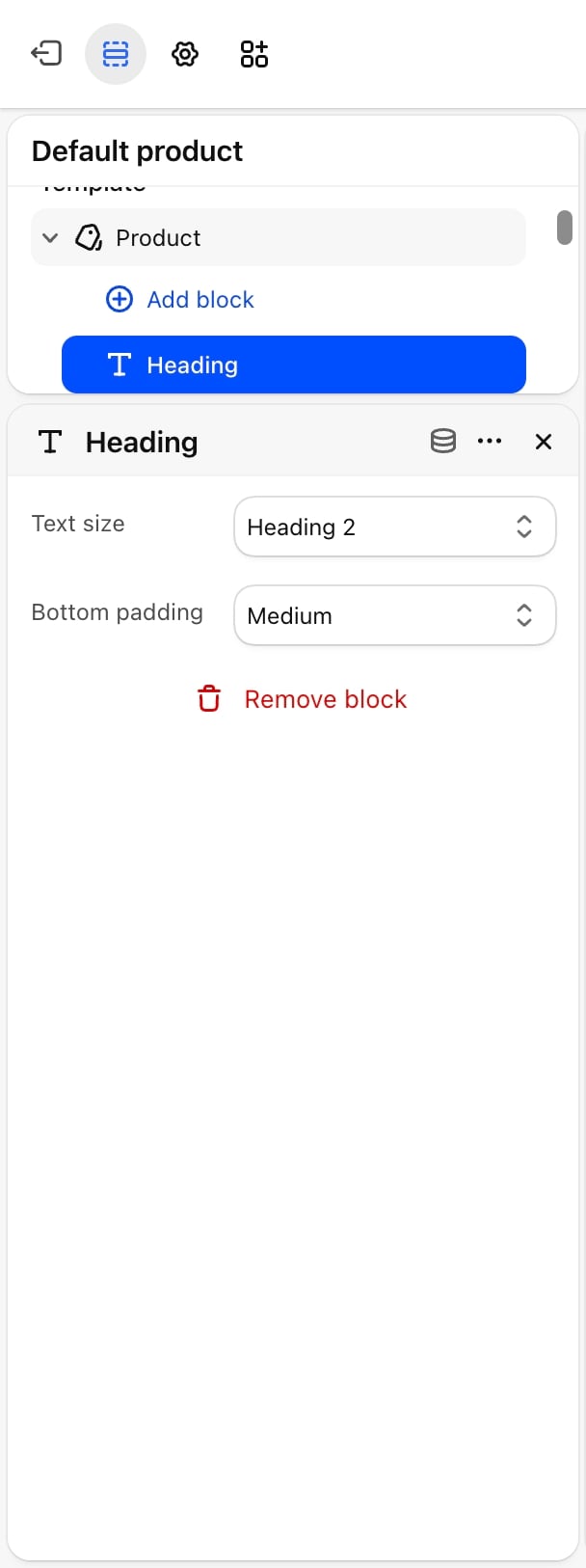
- Text size: Display 2, Heading 1, Heading 2 (default), Heading 3, Heading 4 or Heading 5.
Subtitle
Shows the product’s Subtitle metafield (under Descriptors) on the product in your Shopify admin. The block shows nothing for products without a subtitle.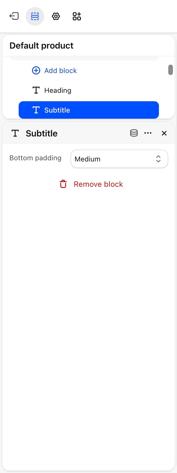
Rating
Shows star rating and review count from the product’s rating metafields, which product review apps fill in. The block shows nothing for products without a rating.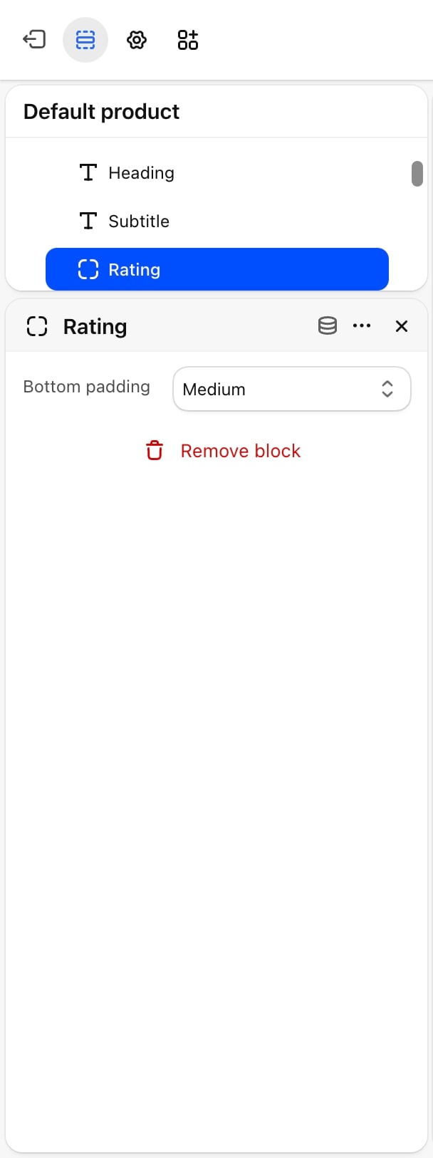
Price
Shows the price of the chosen variant, the compare-at price struck through when it is higher, and the unit price when the variant has one (for example “€2,50/100ml”). All of these update when shoppers pick another variant. When your prices include tax, a “Taxes included.” line appears under the price.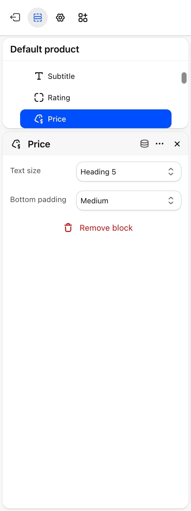
- Text size: Heading 4, Heading 5, Large, Regular, Small (default) or Caption.
Variant picker
Shows one row of choices for each product option, such as size or color, with the chosen value next to the option name. The block is hidden for products without variants.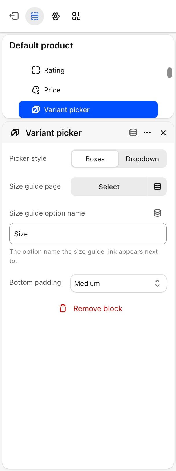
- Picker style: Boxes (default) shows each value as a button. Dropdown shows each option as a select menu, where values that are sold out are marked as such.
- Size guide page: a page from your Shopify admin to open as a size guide. A Size guide link appears next to the option named in Size guide option name, and opens the page content in a side panel.
- Size guide heading: the title at the top of the size guide panel. Leave it blank to use the page title. Appears only when a Size guide page is picked.
- Size guide option name: the option the size guide link appears next to. Default: Size. It must match the option name on your products exactly.
Buy buttons
Shows the quantity selector, the Add to cart button and, optionally, the dynamic checkout buttons. The add to cart button changes to Sold out when the chosen variant is unavailable. If Shop Pay Installments is on in your store, its message shows here too.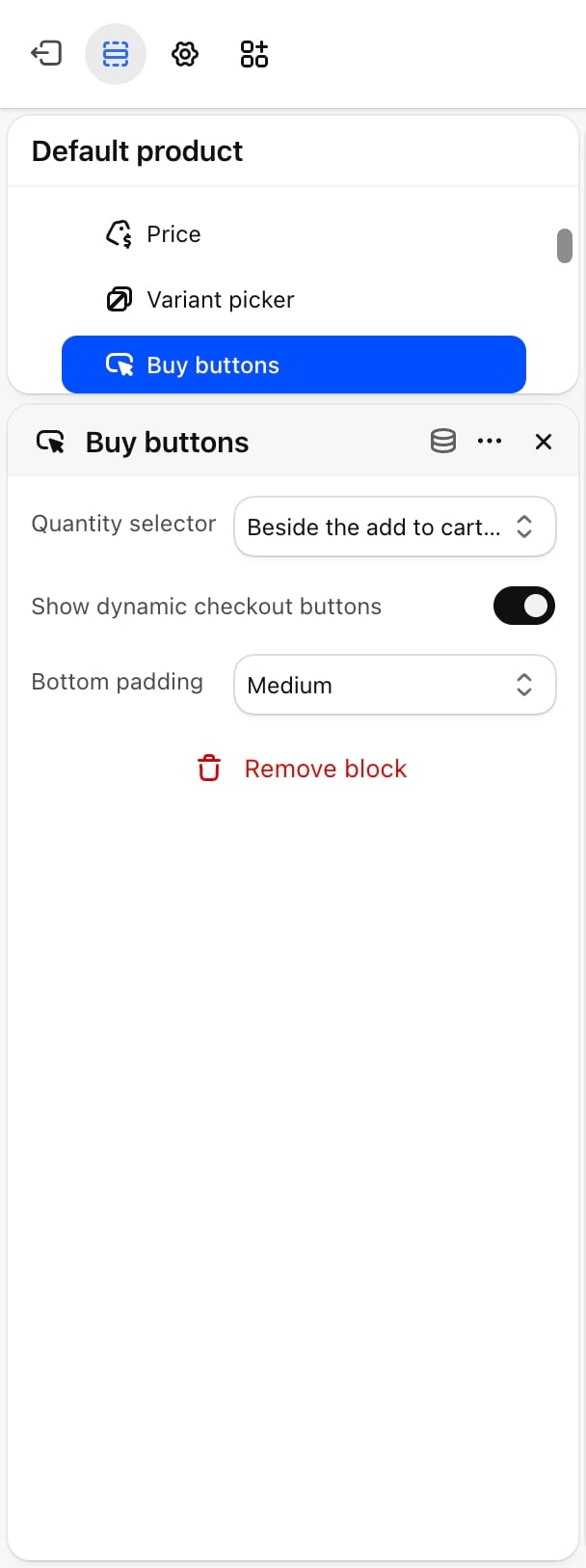
- Quantity selector: Beside the add to cart button (default) or Full row above the add to cart button.
- Show dynamic checkout buttons: on by default. Shows express checkout buttons, such as Shop Pay or PayPal, under the add to cart button. Which buttons show depends on your store’s payment settings.
Icon with text
A short line of text with a small icon, such as a stock or delivery note. You can add as many as you need. The block shows nothing until it has text.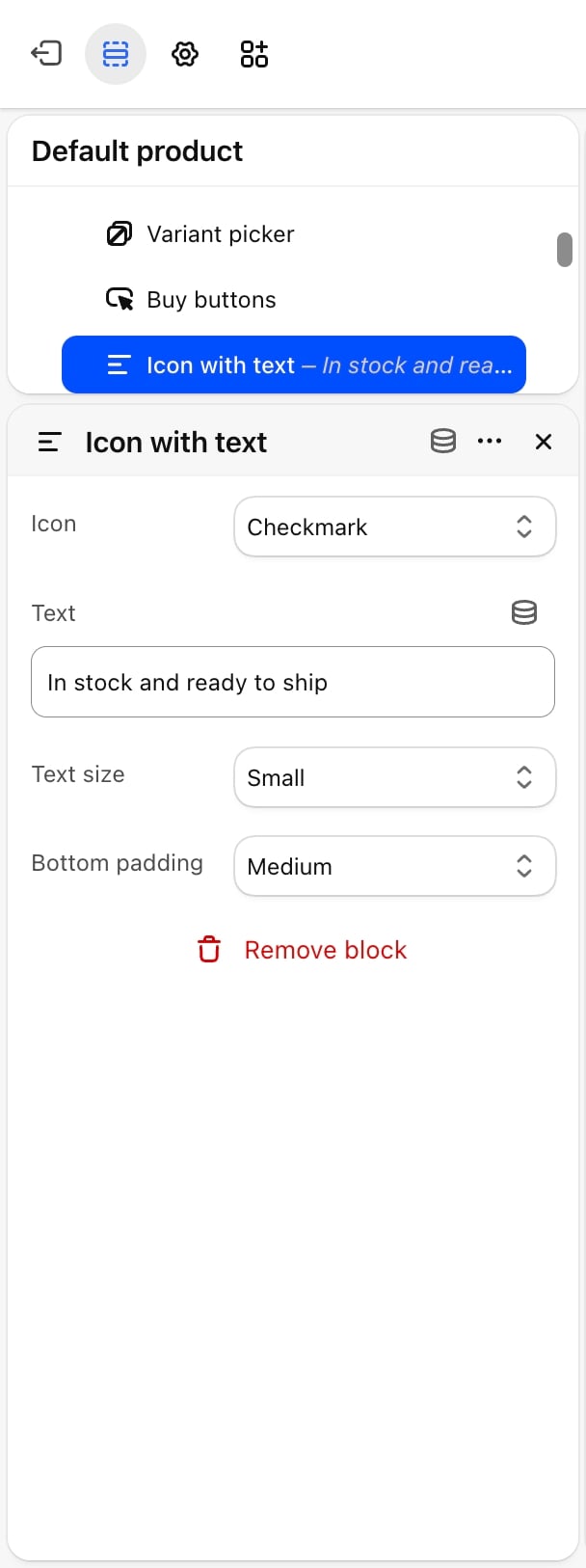
- Icon: Checkmark (default), Delivery truck, Clock, Package, Return arrow, Shield, Store or Payment card.
- Text: default “In stock and ready to ship”.
- Text size: Large, Regular, Small (default) or Caption.
Trust badges
A row of up to four badges, each with a label and an icon. A badge shows only when its Label has text.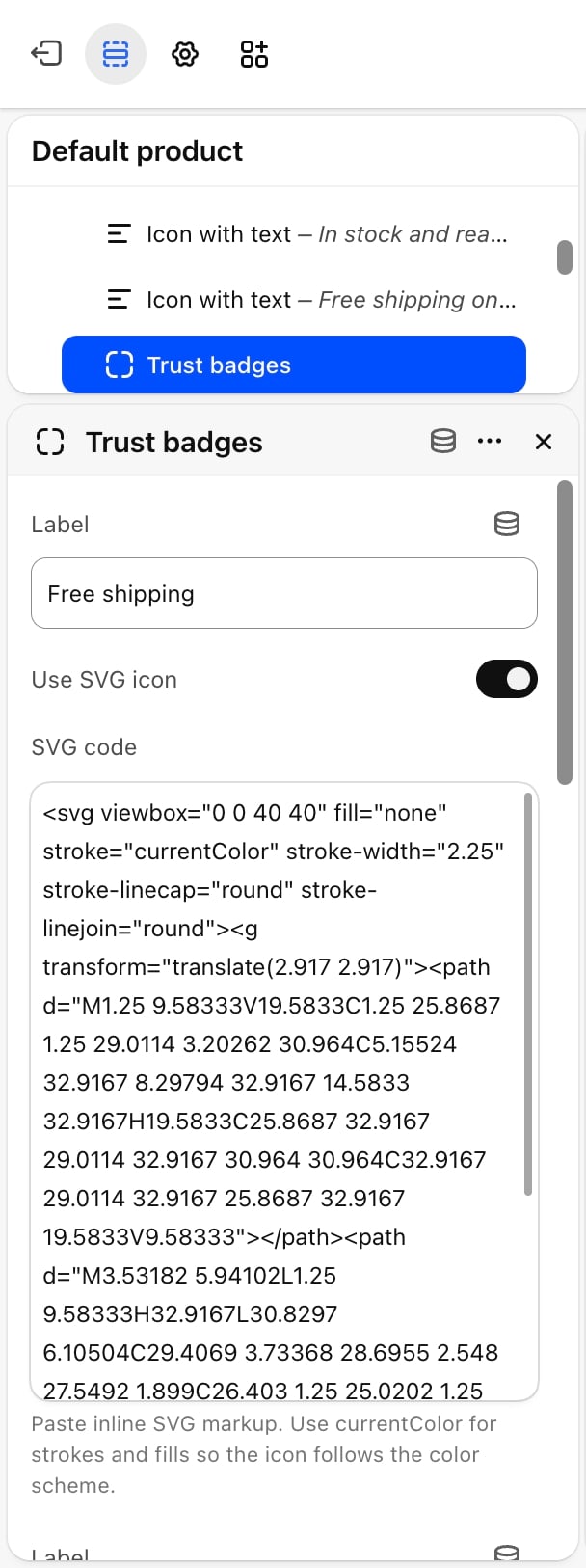
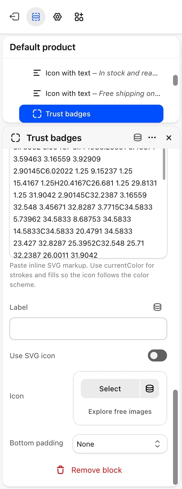
- Badge settings
- SVG tips
Each of the four badges has the same settings:
- Label: the badge text. Defaults: “Free shipping”, “Easy returns” and “Safe checkout”. The fourth badge is empty.
- Use SVG icon: off by default. Turn it on to paste SVG code instead of picking an image.
- Icon: an image for the badge icon. Appears only when Use SVG icon is off.
- SVG code: inline SVG code for the icon. Use
currentColorfor strokes and fills so the icon follows the color scheme. Appears only when Use SVG icon is on.
Pickup availability
Shows whether the chosen variant can be picked up at one of your store locations, and how soon. An arrow opens a panel listing every location with local pickup, its address and its status. The block updates when shoppers change the variant, and shows nothing when no location offers pickup for the variant.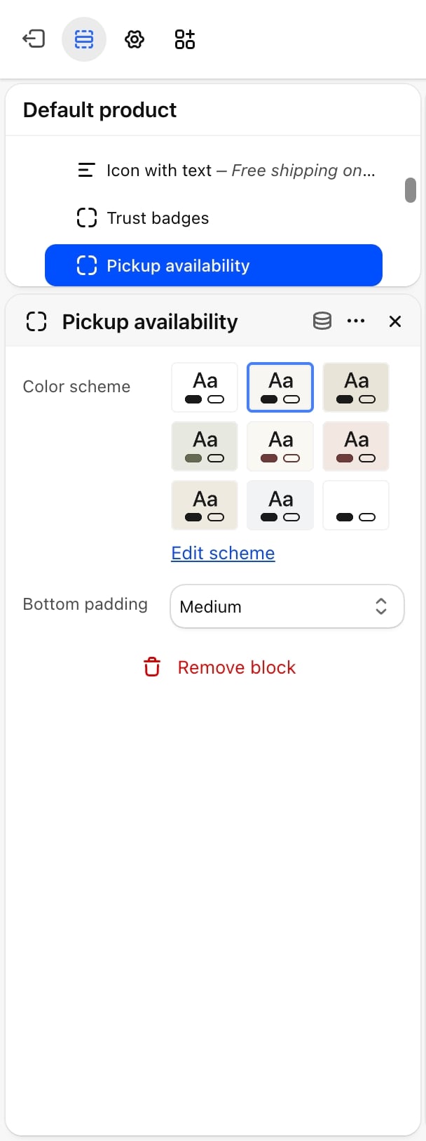
- Color scheme: the colors of the pickup card.
Turn on local pickup for a location in your Shopify admin under Settings, then Shipping and delivery.
Collapsible row
A row that opens to show text, for details such as materials, care or shipping. You can add as many as you need.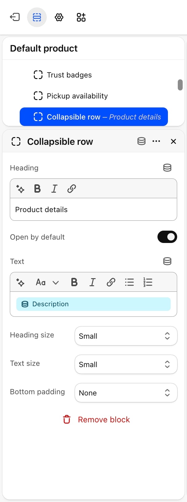
- Heading: default “Product details”.
- Open by default: off by default.
- Text: the content shown when the row opens.
- Heading size: Heading 4, Heading 5, Large, Regular, Small (default) or Caption.
- Text size: Large, Regular, Small (default) or Caption.
Description
Shows the product description from your Shopify admin. The block shows nothing for products without a description.Share
Shows links that share the product on Facebook, X and Pinterest, and a Copy link button that copies the page address. The copy button is hidden in browsers that don’t allow copying.Complementary products
Shows products that go well with this one, such as accessories, under the product pictures. On phones that places it between the gallery and the product details. The products come from the complementary products you set for each product in Shopify’s Search & Discovery app. If a product has none, the block stays hidden.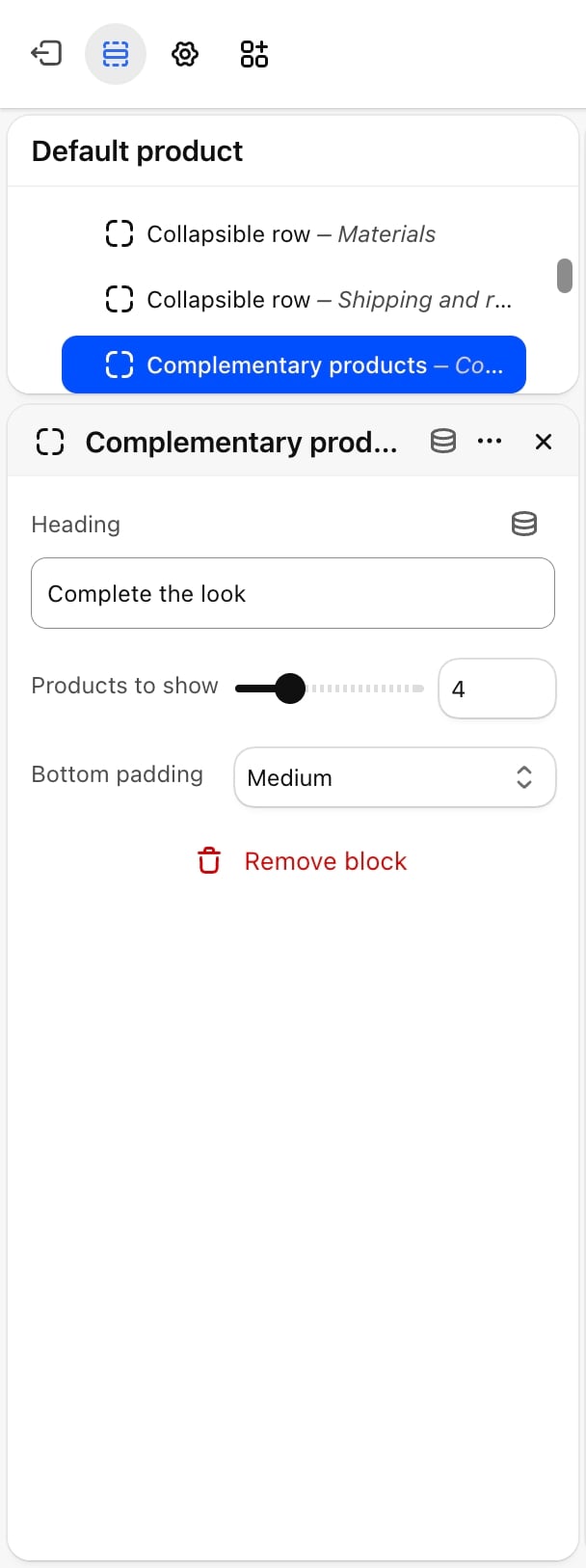
- Heading: default “Complete the look”.
- Products to show: from 2 to 10. Default: 4.
Custom Liquid
Adds your own Liquid or HTML code to the product column. You can add as many as you need.- Custom Liquid: the code to show.
Apps
The product column also accepts app blocks, such as reviews or size charts from apps you install. Click Add block and pick the app block under Apps.Other sections on the product template
The default product template comes with these sections under Product, in this order. Each one can be edited, hidden, removed or reordered.- Additional features: tabs with more product details.
- Related products: products similar to the one in view.
- Recently viewed: products the shopper looked at before.
- FAQ: common questions and answers.
- Promotion banner: a promotion with a countdown and a button.
- Testimonials: customer quotes.
Best practices
- Upload pictures in one shape. Pick the Aspect ratio that matches most of your product photos so pictures are not cropped unevenly.
- Attach a picture to each variant. In your Shopify admin, give each color variant its own picture so the gallery shows the right one when a shopper picks it.
- Use collapsible rows for long details. Keep the description short and move materials, care and shipping into rows so the buy buttons stay near the top.
- Set complementary products for best sellers. The Complementary products block only shows products you have chosen in Search & Discovery.
Related guides
Variants
Choose which options show as color swatches and their shape.
Gift card
See what gift card buyers and recipients get.