

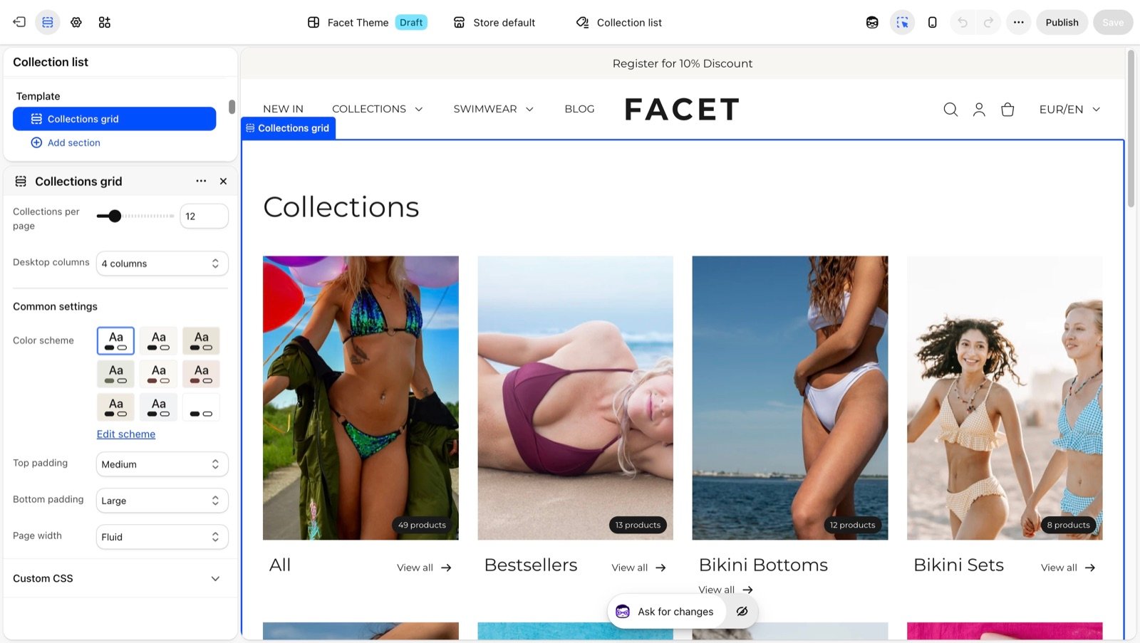
/collections. In Facet it is built from the Collections grid section. This page covers what each card shows and the section settings.

What this section controls
- How many collections show per page, with page numbers when there are more.
- How many columns the grid has on large screens.
- The colors and spacing of the page.
- The collection picture. Without one, the picture of the collection’s first product is used.
- A badge with the number of products in the collection.
- The collection title and a View all link.
Getting started
1
Open the Theme Customizer
In your Shopify admin, open Online Store, then Themes, and click Customize next to Facet.
2
Open the collection list template
In the template picker at the top of the Theme Customizer, choose Collections list. Then click Collections grid in the Sections panel.
3
Set the grid
Choose Desktop columns and Collections per page.
Section settings
Grid
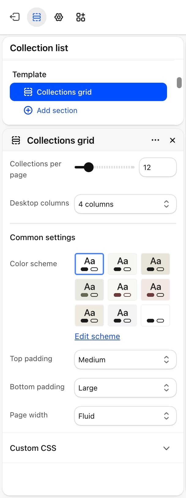
- Collections per page: from 4 to 48, in steps of 4. Default: 12. When you have more collections, page numbers appear under the grid.
- Desktop columns: 2 columns, 3 columns or 4 columns (default). Phones always show 2 columns.
Common settings
- Color scheme: the colors of the section.
- Top padding: None, Small, Medium (default), Large or Extra large.
- Bottom padding: None, Small, Medium, Large (default) or Extra large.
- Page width: Narrow, Narrower, Fluid (default) or Full.
Best practices
- Give every collection a picture. Set a collection image in your Shopify admin under Products, then Collections, so the grid does not depend on whichever product comes first.
- Use pictures of one shape. Cards look tidier when all collection pictures share the same proportions.
- Link to the page from your menu. Add a menu item that points to All collections so shoppers can find this page.
Related guides
Collection page
Set up the page each collection card opens.
Collection highlights
Feature chosen collections on any page.