

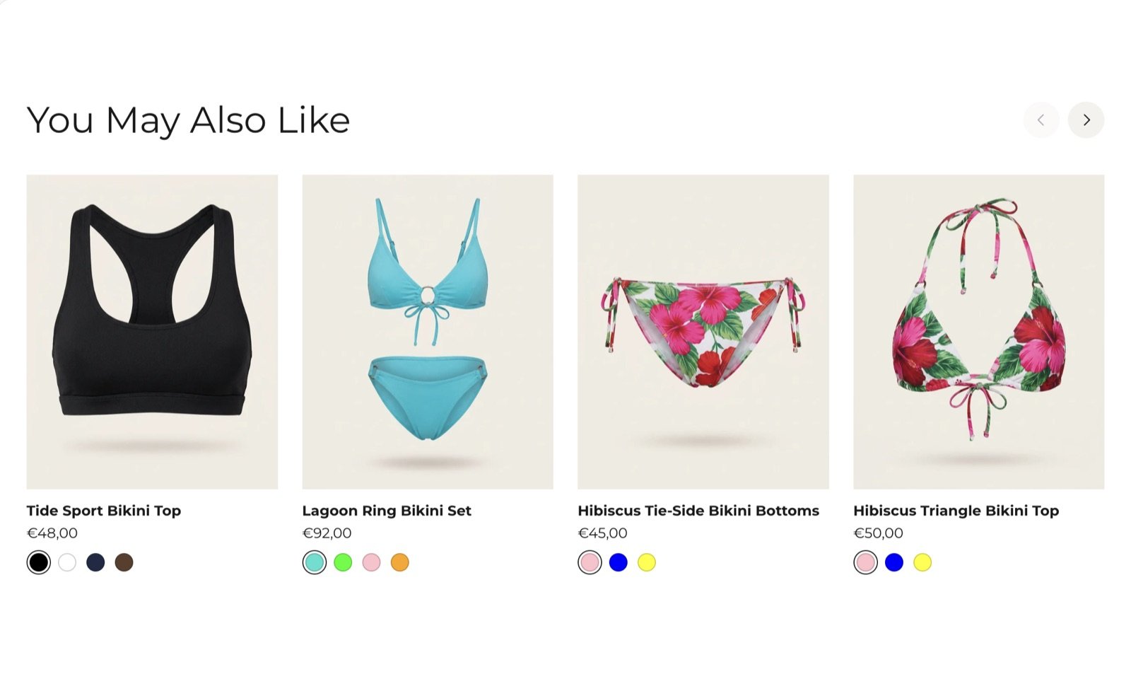
What this section controls
- The heading above the row.
- How many products the row can show.
- How many cards fit across the screen on desktop.
Where the products come from
There is no product picker. The section asks Shopify’s product recommendations for products related to the one on the page. Shopify picks them from your sales and product information, and the list improves as your store gets orders. To choose the suggestions yourself, use the free Shopify Search & Discovery app. Related products you set for a product in that app are part of these recommendations. The theme has no setting or metafield of its own for this. When Shopify has no recommendations for a product, for example in a new store, the whole section stays hidden.Getting started
1
Open the Theme Customizer
In your Shopify admin, open Online Store, then Themes, and click Customize next to Facet.
2
Open a product page
Use the page selector at the top to open Products, then Default product.
3
Add the section
Click Add section and choose Related products. Drag it under the product information.
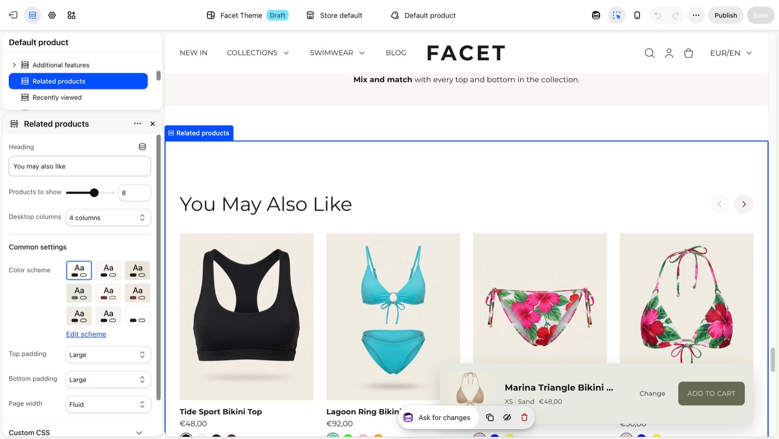
Section settings
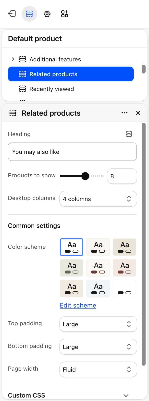
- Heading: the title above the row. Default: “You may also like”.
- Products to show: from 2 to 12. Default: 8. Shopify may return fewer.
- Desktop columns: 3 columns, 4 columns (default) or 5 columns. Phones show 2 cards across and tablets 3. Shoppers scroll the row sideways to see more.
Common settings
- Color scheme: the colors of the section.
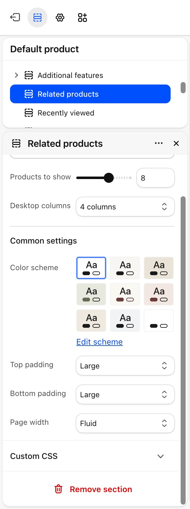
- Top padding and Bottom padding: None, Small, Medium, Large (default) or Extra large.
- Page width: Narrow, Narrower, Fluid (default) or Full.
Best practices
- Curate your best sellers. Set related products for your top products in Search & Discovery so their suggestions are always on brand.
- Place it under the product information. Shoppers see the suggestions after they have read about the product, not before.
- Check a new product in a preview. If the row doesn’t show, Shopify has no suggestions for it yet.
Related guides
Product page
Set up the product template this section sits on.
Recently viewed
Bring back products the shopper looked at before.