

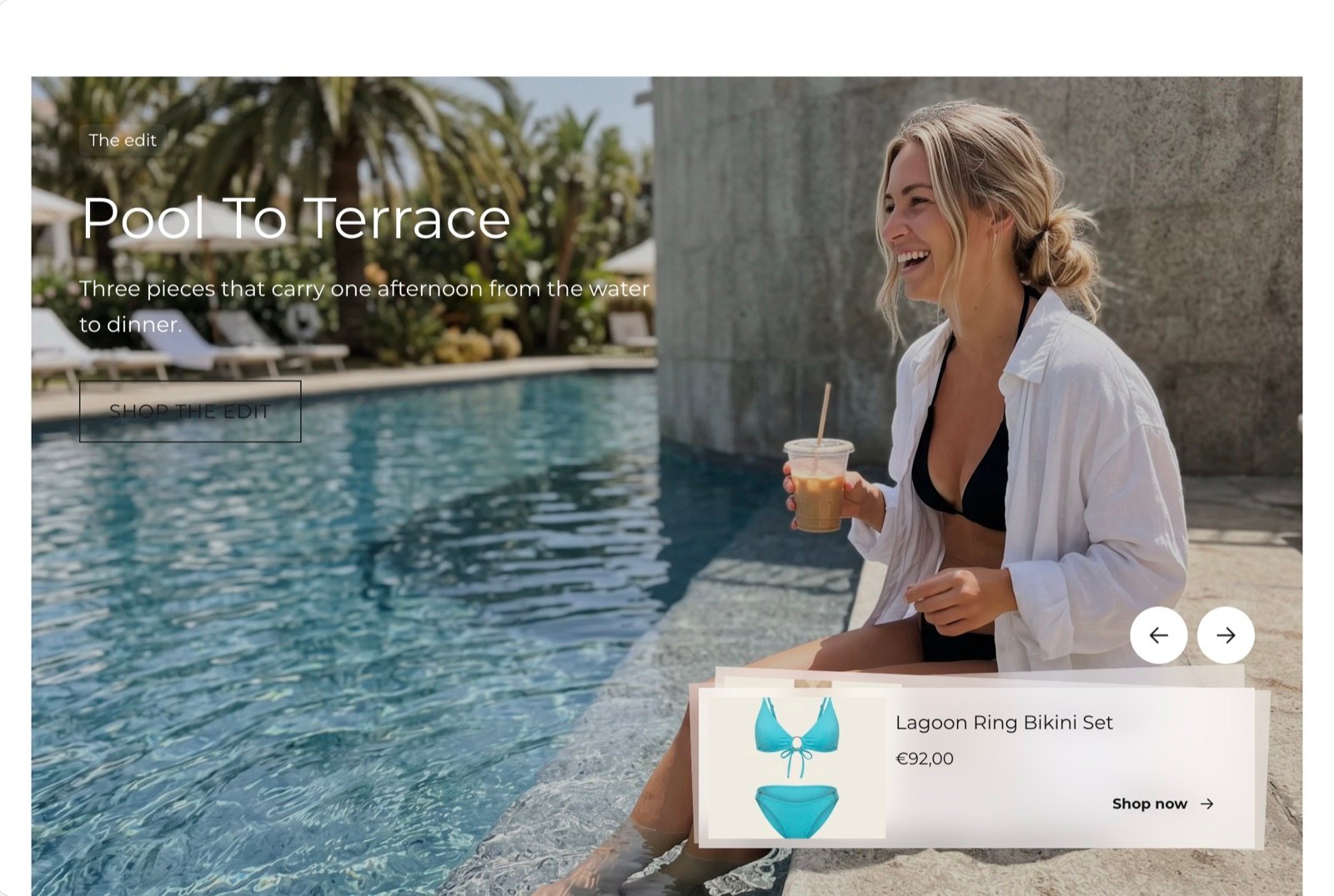
What this section controls
- The picture or video and the banner height.
- A tint over the picture.
- Where the text sits over the picture.
- How the product cards are arranged, where they sit and how they look.
- The layout on phones.
Getting started
1
Open the Theme Customizer
In your Shopify admin, open Online Store, then Themes, and click Customize next to Facet.
2
Add the section
In the Sections panel, click Add section and choose Spotlight. It can’t be added to the header or footer.
3
Pick the media
Click Spotlight, choose Image, Video or External video under Media, and add the file or link.
4
Add products
Click Add block, then Product spotlight, and pick a product. Repeat for each product card.
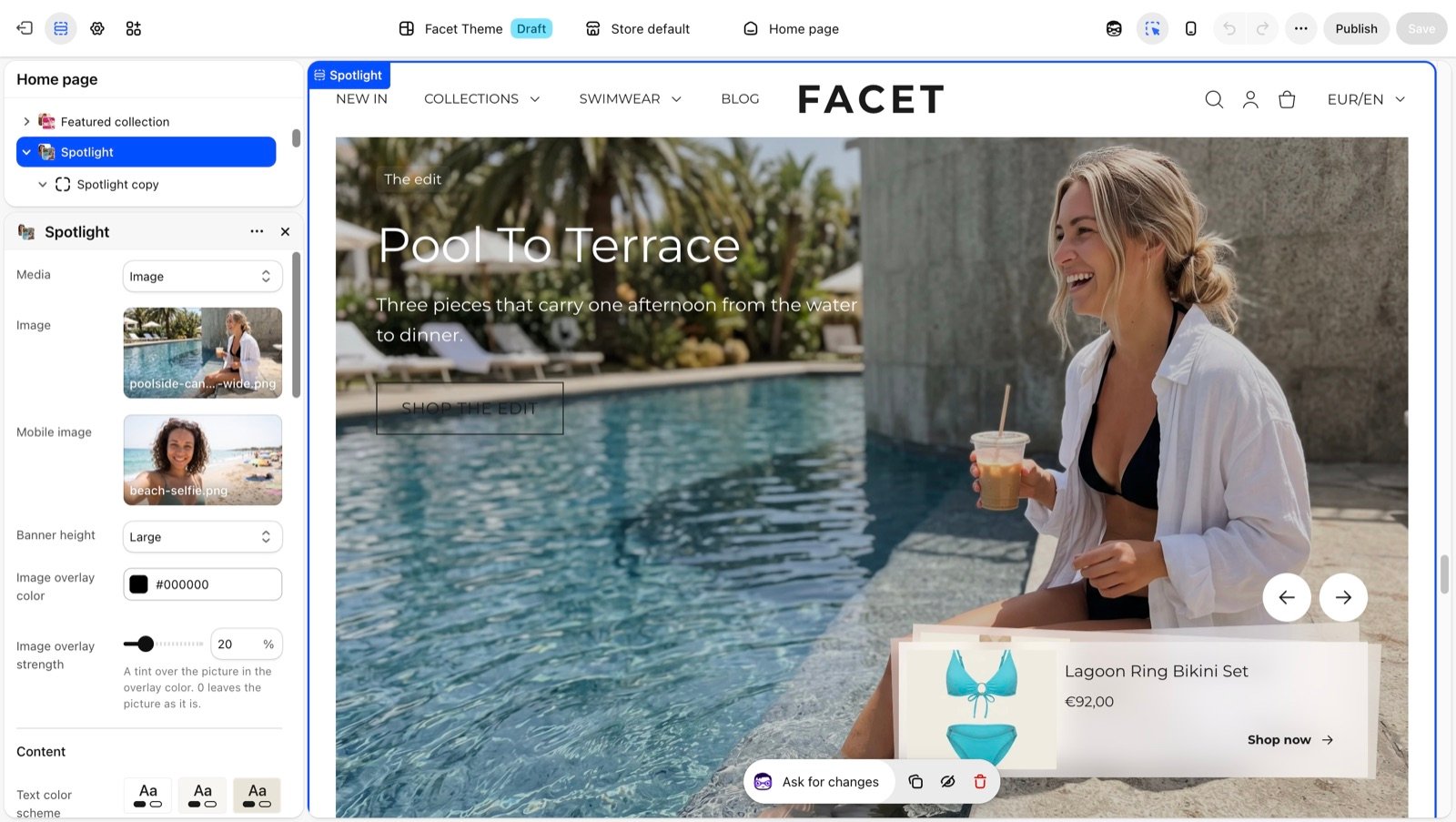
Section settings
Media
Media
Media
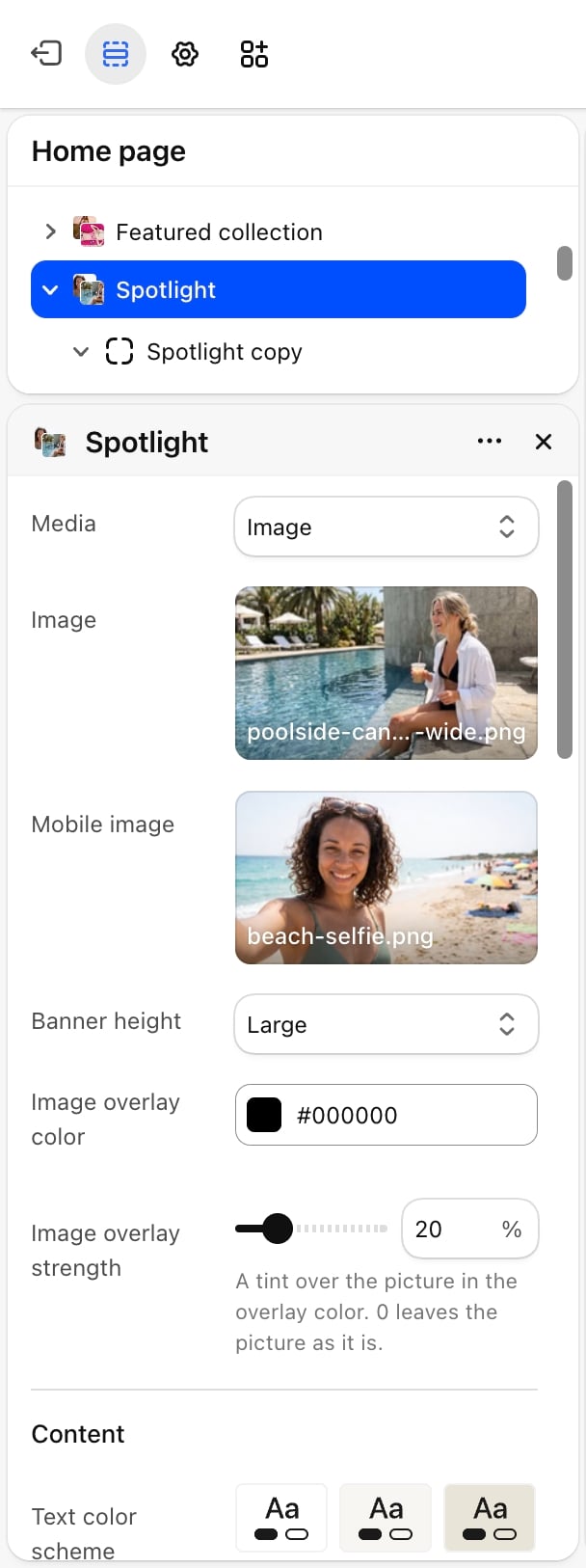
- Image (default): shows Image, and Mobile image on phones if you add one. A placeholder shows until you pick a picture.
- Video: a video you upload to Shopify. It plays muted on a loop behind the content.
- External video: a YouTube or Vimeo link. It plays muted on a loop behind the content.
Image overlay color and Image overlay strength
Image overlay color and Image overlay strength
A tint over the picture to help text stand out. Image overlay color defaults to black. Image overlay strength goes from 0% to 90%. Default: 20%. At 0% the picture shows as it is.
Content
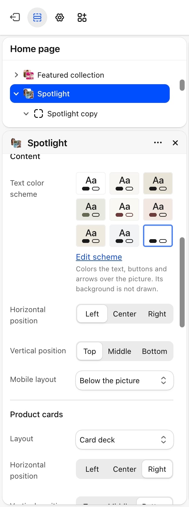
- Text color scheme: colors the text, buttons and arrows over the picture. Its background color is not drawn, so the picture shows through.
- Horizontal position: Left (default), Center or Right.
- Vertical position: Top (default), Middle or Bottom.
- Mobile layout: Below the picture (default) or Over the picture.
How Mobile layout works
How Mobile layout works
- Below the picture: on phones the text sits above the picture and the product cards in a row below it, both in the section’s own Color scheme. Frosted cards turn solid here.
- Over the picture: the text stays on the picture at the top and the cards at the bottom, whatever positions you chose for desktop.
Product cards
Layout
Layout
- Stacked down the side: the cards sit one under another.
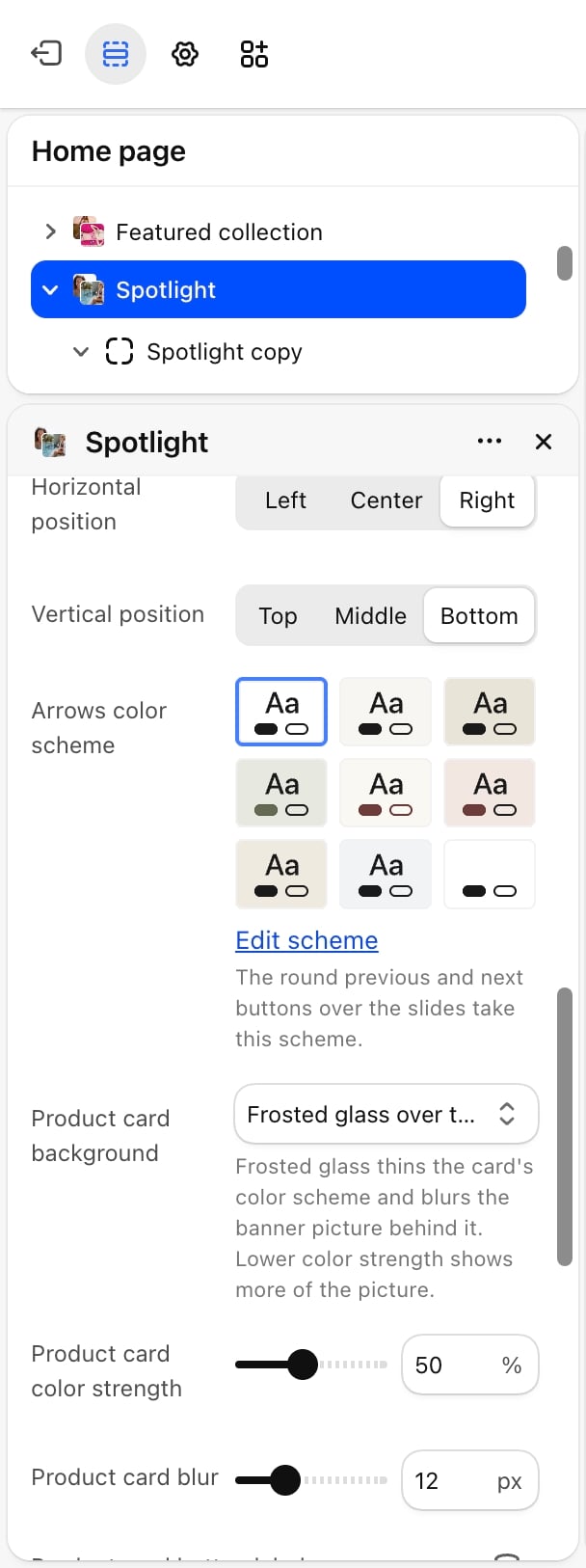
- Card deck (default): the cards sit on one pile, with the cards behind the top one peeking out at a slight tilt. Round previous and next arrows above the pile bring the next card to the front. The arrows show when there are two or more cards. In the Theme Customizer, the card you select comes to the front.
Horizontal position and Vertical position
Horizontal position and Vertical position
Where the cards sit over the picture. Horizontal: Left, Center or Right (default). Vertical: Top, Middle or Bottom (default).
Arrows color scheme
Arrows color scheme
The colors of the round deck arrows, so they stay readable on the picture whatever the text color scheme.
Product card background
Product card background
- Solid color scheme: fills each card with its color scheme.
- Frosted glass over the picture (default): thins the card’s color scheme and blurs the picture behind it.
- Product card color strength: from 20% to 90%. Default: 50%. Lower values show more of the picture.
- Product card blur: from 4 to 32 pixels. Default: 12.
Common settings
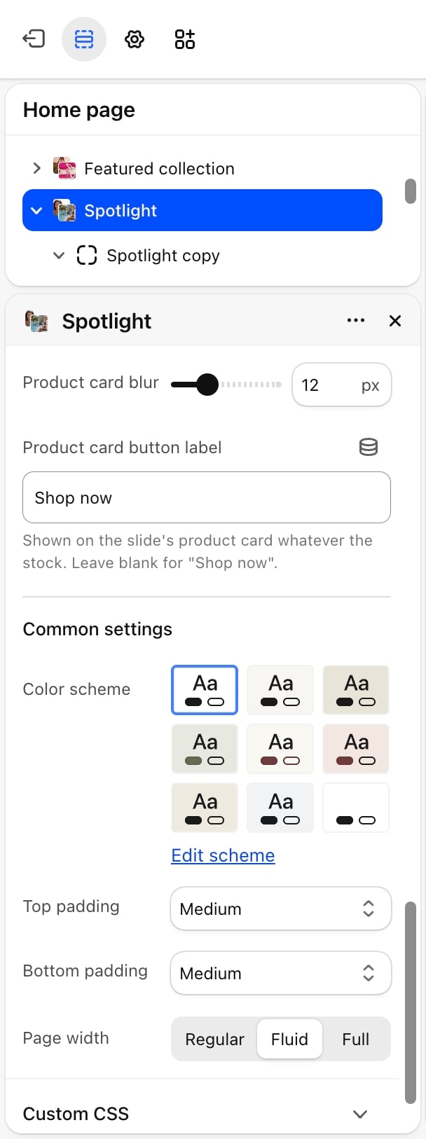
- Color scheme: the colors of the section around the banner, and of the text and cards on phones with Below the picture.
- Top padding and Bottom padding: None, Small, Medium (default), Large or Extra large.
- Page width: Regular, Fluid (default) or Full.
Blocks
Text
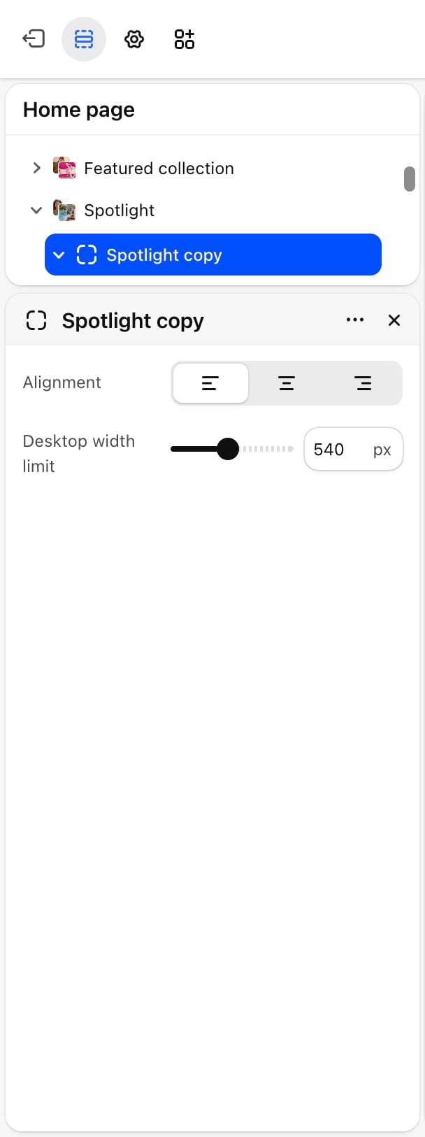
- Alignment: Left (default), Center or Right. Lines up the blocks inside the text box.
- Desktop width limit: from 320 to 800 pixels. Default: 540. The widest the text box can be.
Product spotlight
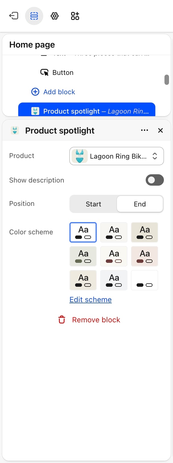
- Product: picked with the product picker. The card shows the product’s featured image, title, a short description and the price, with the compare-at price struck through when there is one. Until you pick a product, the card shows example content in the Theme Customizer and is hidden in your store.
- Show description: on by default. Shows the first 8 words of the product description. On phones the card is more compact and leaves the description out.
- Position: Start or End (default). With Stacked down the side, the card lines up with the left or right edge of the stack.
- Color scheme: the card’s colors.
Best practices
- Use two or three cards in a deck. The deck shows up to three cards at once, so more than that stay hidden until shoppers click through.
- Keep text and cards apart. Put the text and the cards in different corners, for example text at the top left and cards at the bottom right, so they don’t overlap.
- Raise the overlay for busy pictures. An overlay strength of 30% to 40% keeps white text readable over a bright picture.
- Add a mobile image. A portrait crop keeps the subject in view on phones.
Related guides
Hero banner
A slideshow with the same product card on each slide.
Featured product
Show one product with its full buy options.