

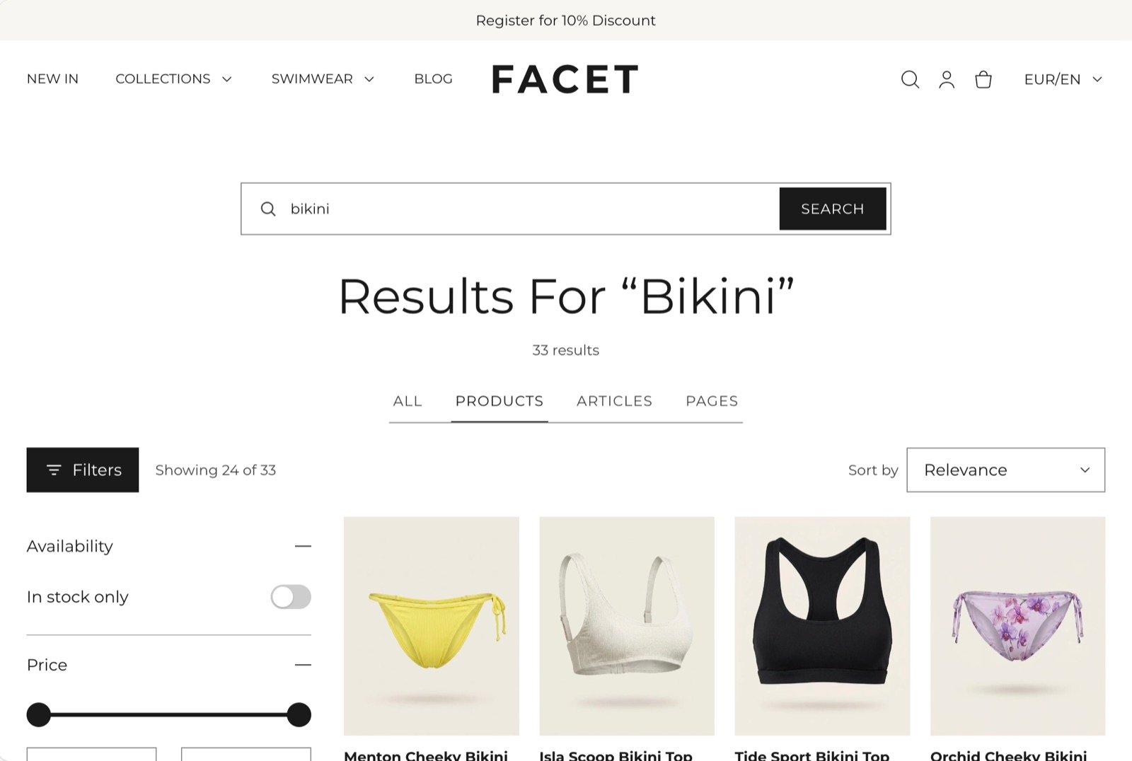
What this section controls
- Tabs that narrow results to products, articles or pages.
- Filters in a sidebar or a drawer, and the sort menu.
- How many results show per page and how many columns on large screens.
- How shoppers reach more results: page numbers, a Load more button, or loading as they scroll.
- The popular searches suggested when a search finds nothing.
Getting started
1
Open the Theme Customizer
In your Shopify admin, open Online Store, then Themes, and click Customize next to Facet.
2
Open the search template
In the template picker at the top of the Theme Customizer, choose Search. Then click Search in the Sections panel.
3
Pick popular searches
Choose a menu for Popular searches menu so shoppers get suggestions when nothing matches.
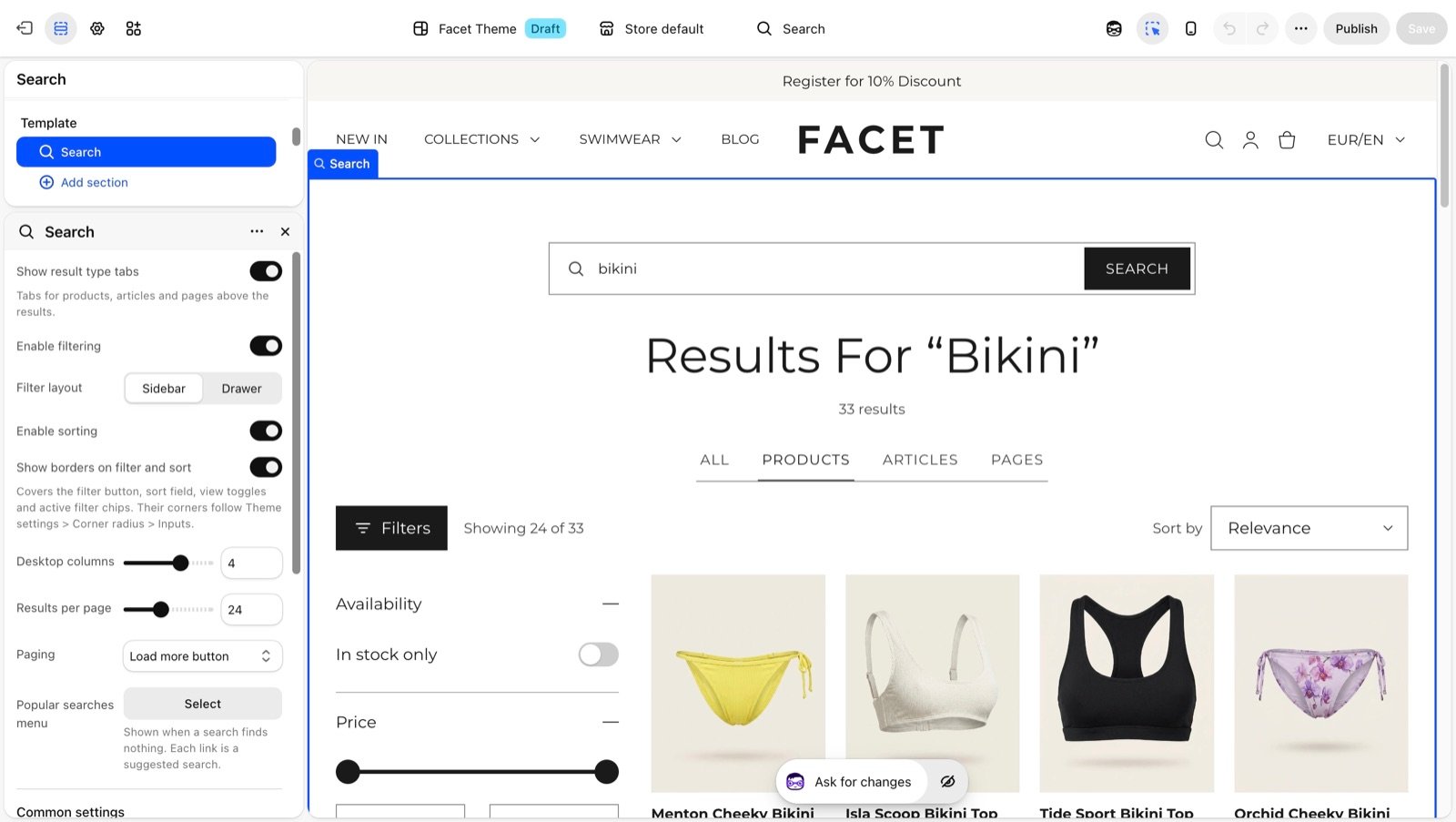
Section settings
Results
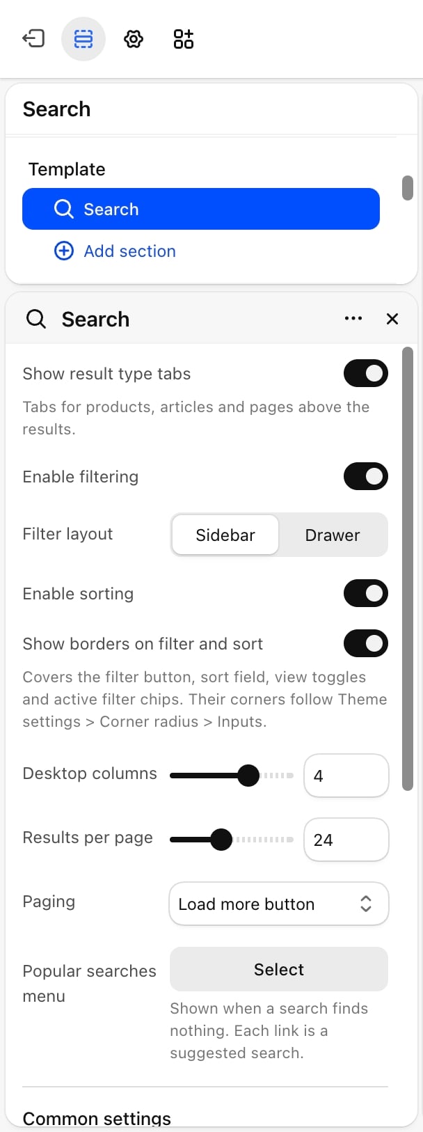
- Show result type tabs: on by default. Shows All, Products, Articles and Pages tabs above the results.
- Desktop columns: from 2 to 5. Default: 4. Phones always show 2 columns.
- Results per page: from 8 to 48, in steps of 4. Default: 24.
Paging
Paging
- Page numbers: numbered links under the results.
- Load more button (default): a button that adds the next results under the ones in view, with a “Showing X of Y” count.
- Load as the page scrolls: the next results load on their own when the shopper reaches the end of the list.
Filters and sorting
- Enable filtering: on by default. Shows filters for the product results, such as availability, price, size or color. Filters come from Shopify’s Search & Discovery app, the same way as on the Collection page.
- Filter layout: Sidebar (default) or Drawer. On tablets and phones, both open the filters in a drawer. Appears only when Enable filtering is on.
- Enable sorting: on by default. Shows a Sort by menu, such as relevance or price.
- Show borders on filter and sort: on by default. Draws borders around the Filters button, the sort menu and the active filter chips. Their corners follow the inputs setting in Corner radius.
Common settings
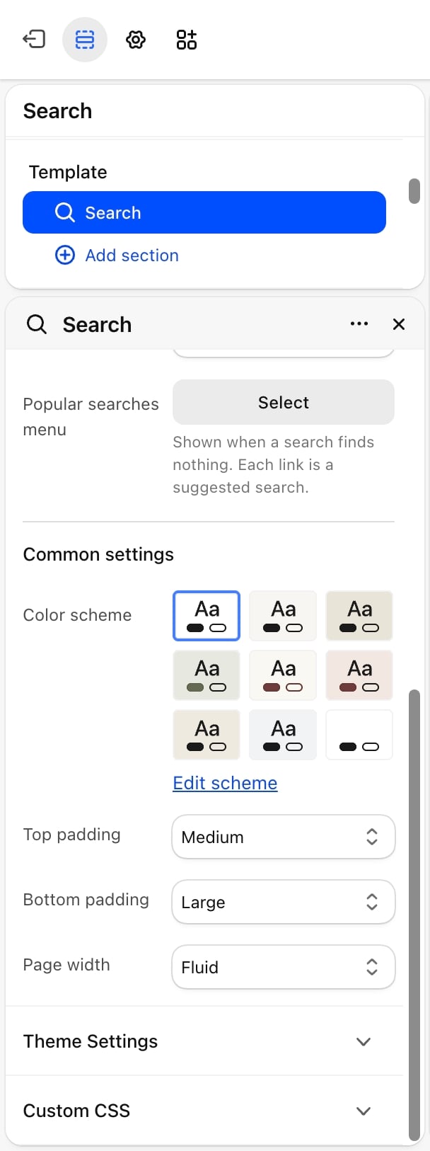
- Color scheme: the colors of the section.
- Top padding: None, Small, Medium (default), Large or Extra large.
- Bottom padding: None, Small, Medium, Large (default) or Extra large.
- Page width: Narrow, Narrower, Fluid (default) or Full.
Predictive search drawer
When a shopper clicks the search icon in the header, a search drawer opens from the side. Before they type, it shows your popular searches. Once they type two or more characters, it shows matching products, collections, pages, articles and suggested search terms as they type. Pressing Enter opens this search page with the full results. The drawer has no settings of its own here. Its style, popular searches menu and color scheme are set in the Header section, under Search. See Header.Best practices
- Fill the popular searches menu. Create a menu in Content, then Menus, with your most searched terms, and use it here and in the header.
- Use Load more for browsing. It keeps earlier results in view, so shoppers don’t lose their place.
- Write clear page and article excerpts. Article and page results show a short excerpt, so a clear opening line helps shoppers pick the right one.
Related guides
Header
Set the search style and popular searches in the drawer.
Collection page
Learn how filters from Search & Discovery work.