

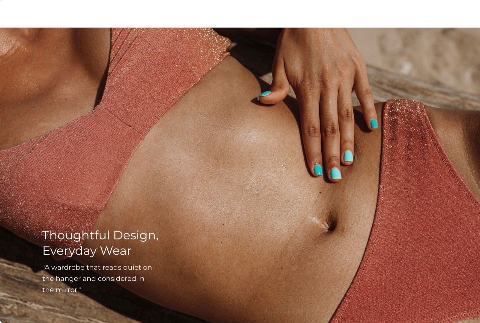
What this section controls
- The picture, with a separate picture for phones.
- Where the picture sits and its shape.
- The alignment of the text.
- The colors of the card and of the band around it.
Getting started
1
Open the Theme Customizer
In your Shopify admin, open Online Store, then Themes, and click Customize next to Facet.
2
Add the section
In the Sections panel, click Add section and choose Image with text. The section can’t be added to the header or footer.
3
Pick the picture
Click Image with text, choose an Image, and set Image position.
4
Write the text
Edit the heading, text and button blocks.
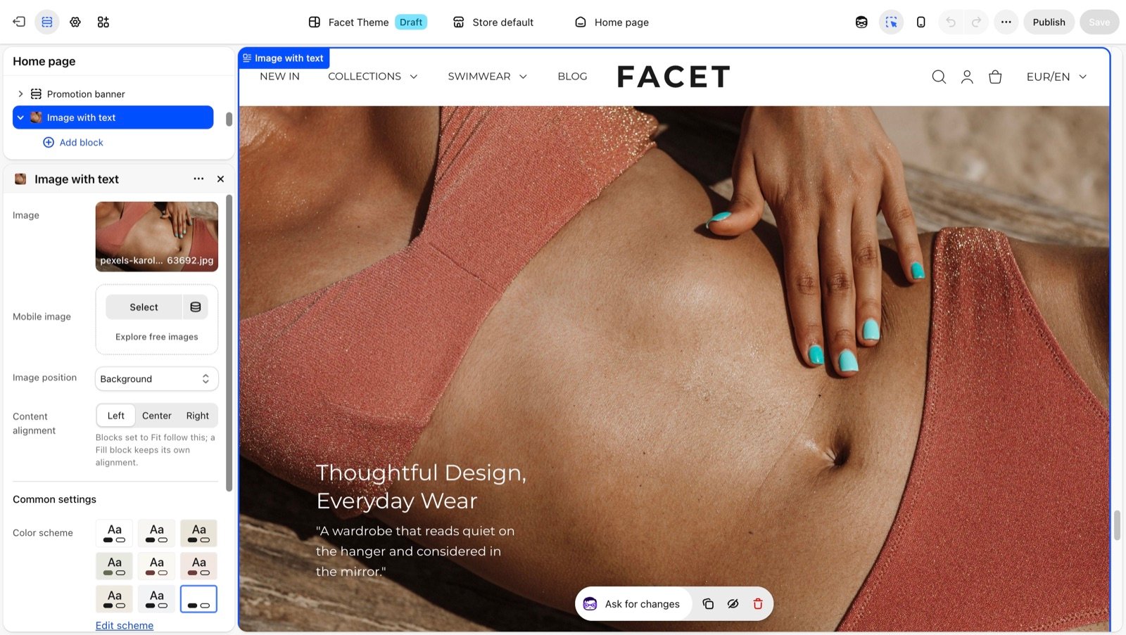
Section settings
Picture and layout
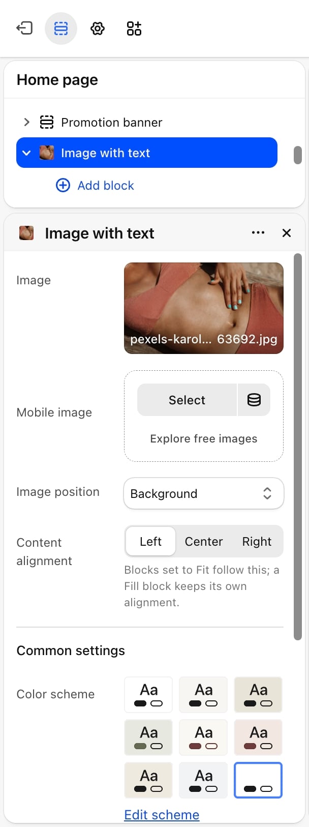
Image and Mobile image
Image and Mobile image
Image is the section picture. Mobile image is an optional picture for phones, for example a portrait crop. Without one, phones show Image. Until you choose a picture, a placeholder shows.
Image position
Image position
- Left (default): the picture sits left of the text on screens 750 pixels wide and larger.
- Right: the picture sits right of the text on screens 750 pixels wide and larger.
- Background: the picture fills the card and the text sits on top of it. The card is at least 685 pixels tall on large screens and 480 pixels on phones.
Image aspect ratio
Image aspect ratio
The shape of the picture: Natural, 1:1, 4:5 (default), 3:4, 2:3, 5:4, 4:3 or 16:9. Natural keeps the picture’s own shape. Appears only when Image position is not Background.
Content alignment
Content alignment
Left (default), Center or Right. Blocks set to fit their content follow this alignment. A block set to fill the width keeps its own alignment.
Common settings
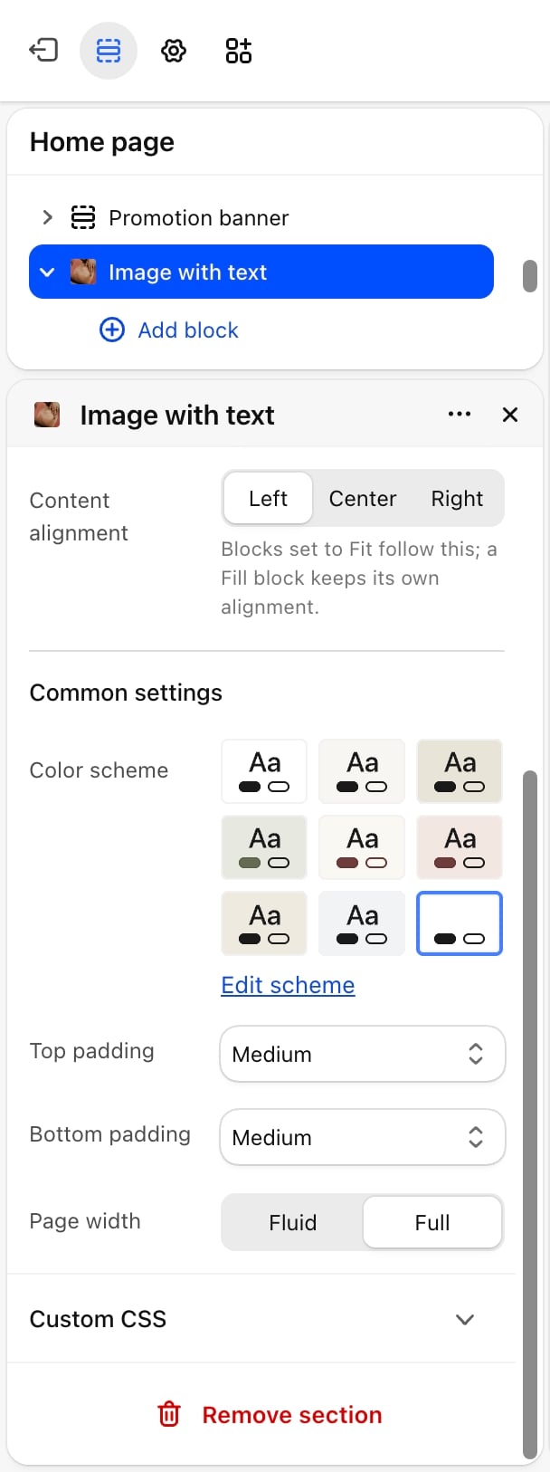
- Color scheme: with the picture left or right, it colors the band behind the card. With Background, it colors the text over the picture.
- Card color scheme: the colors of the card that holds the picture and text. Appears only when Image position is not Background.
- Top padding and Bottom padding: None, Small, Medium (default), Large or Extra large.
- Page width: Fluid (default) or Full.
Blocks
Heading, text and button
Add Heading, Text and Button blocks for the copy beside or over the picture. Their settings are described on Theme blocks.Best practices
- Check contrast with Background. Text over a picture is easiest to read on a calm area of the picture, with a color scheme whose text color stands out from it.
- Add a mobile image for Background. A wide picture behind text loses its subject on a phone. A portrait crop keeps it in view.
- Alternate sides. When you stack several image with text sections, switch between Left and Right so the page doesn’t feel repetitive.
Related guides
Colors
Create the schemes for the card and the band.
Theme blocks
Settings for the heading, text and button blocks.