

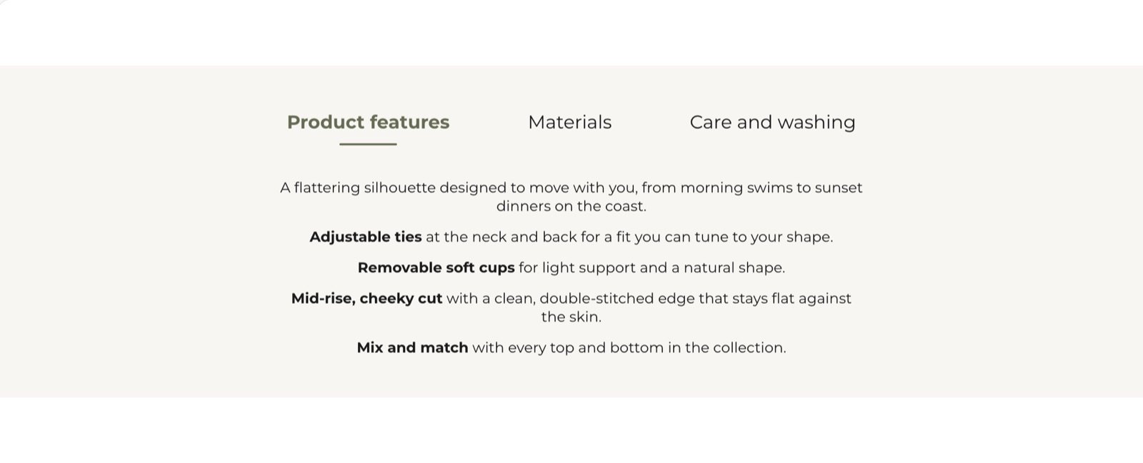
What this section controls
- An intro heading and text above the card.
- The tabs inside the card, and the content of each tab.
- The card’s color scheme, width and spacing.
Getting started
1
Open the Theme Customizer
In your Shopify admin, open Online Store, then Themes, and click Customize next to Facet.
2
Add the section
In the Sections panel, click Add section and choose Additional features. The section can’t be added to the header or footer.
3
Add tabs
Click Add block, then Tab. Type the tab name in Label, then add Heading and Text blocks inside the tab.
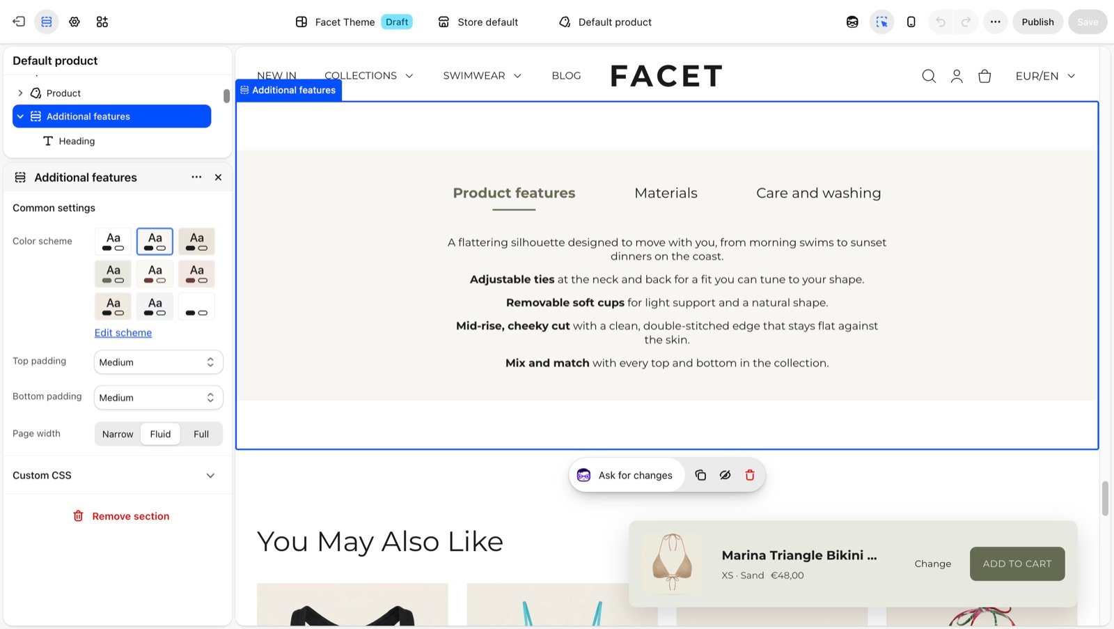
Section settings
Common settings
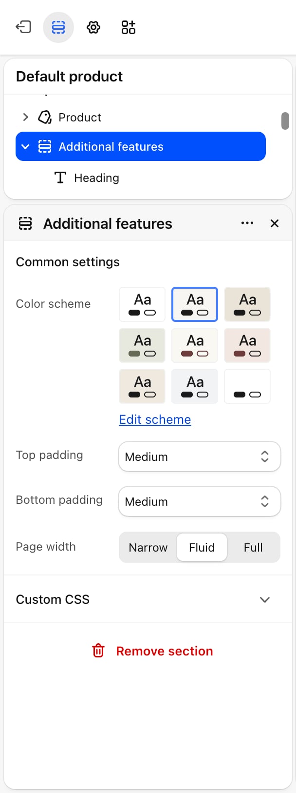
- Color scheme: colors the tab card. The intro heading and text above the card sit on the page background.
- Top padding and Bottom padding: None, Small (default), Medium, Large or Extra large.
- Page width: Narrow, Fluid (default) or Full.
Blocks
Intro heading and text
The section has a fixed Heading and Text block above the card. Leave them empty if you don’t need an intro. Their settings are described on Theme blocks.Tab
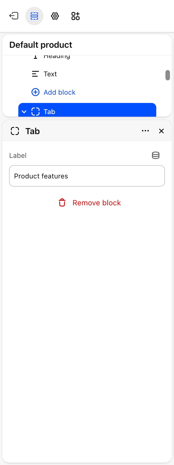
- Label: the name shown on the tab. Default: “Product features”.
When the tab names don’t fit on one line, for example on phones, the row of tabs scrolls sideways. Shoppers can also move between tabs with the left and right arrow keys.
Best practices
- Keep tab labels short. One or two words per tab, such as “Fabric” or “Care”, keep more tabs visible on a phone.
- Give every tab content. A tab with an empty panel looks broken. Remove tabs you don’t use.
- Put the most important tab first. Only the first tab is open when the page loads, so many shoppers never see the others.
Related guides
Theme blocks
Settings for the heading and text blocks inside each tab.
Collapsible content
Show details as rows that open and close instead of tabs.