


What this section controls
- The features in the row, with their icons and text.
- Lines between the features.
- The section colors, width and spacing.
Getting started
1
Open the Theme Customizer
In your Shopify admin, open Online Store, then Themes, and click Customize next to Facet.
2
Add the section
In the Sections panel, click Add section and choose Features. The section can’t be added to the header.
3
Set up each feature
Click a Feature block to choose its icon, then edit the heading and text inside it. Click Add block, then Feature, to add more.

Section settings
Layout
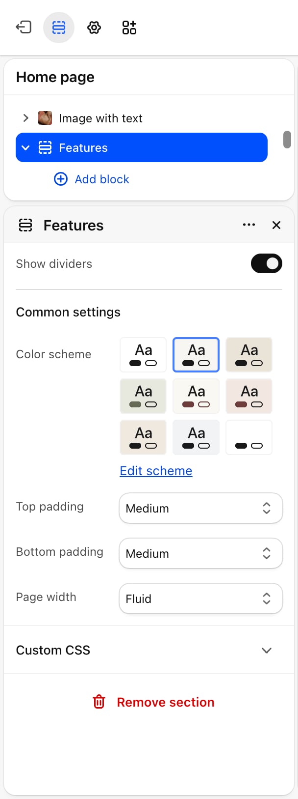
- Show dividers: off by default. Draws a thin line between the features, in the color scheme’s border color.
Common settings
See Common settings for details.- Color scheme: the colors of the section. SVG icons that use the current color follow its text color.
- Top padding and Bottom padding: None, Small, Medium (default), Large or Extra large.
- Page width: Narrow, Narrower, Fluid (default) or Full.
Blocks
Feature
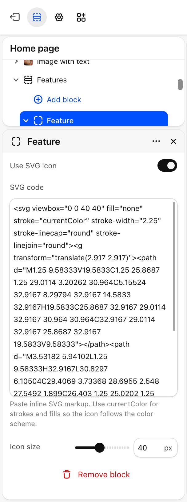
Use SVG icon
Use SVG icon
Off by default. Off, the feature uses the picture in Icon. On, it uses the code in SVG code.
Icon
Icon
A picture to use as the icon, such as a PNG or SVG file from your files. Appears only when Use SVG icon is off. Leave it empty for a feature without an icon.
SVG code
SVG code
Paste inline SVG code. Use
currentColor for strokes and fills so the icon follows the color scheme. Appears only when Use SVG icon is on.The icon only shows when the code contains an <svg> tag. For safety, Facet hides SVG code that contains scripts or event handlers such as onload or onclick.Icon size
Icon size
From 24 to 60 pixels, in steps of 4. Default: 40. Applies to both picture and SVG icons.
Best practices
- Use three or four features. More than four make each one narrow on a laptop.
- Keep icons in one style. Icons from one set, with the same line weight, look tidier than mixed pictures.
- Prefer SVG icons. An SVG with
currentColorstays sharp at any size and changes color with the color scheme.
Related guides
Theme blocks
Settings for the heading and text inside each feature.
Colors
Set the text and border colors the icons and dividers use.