

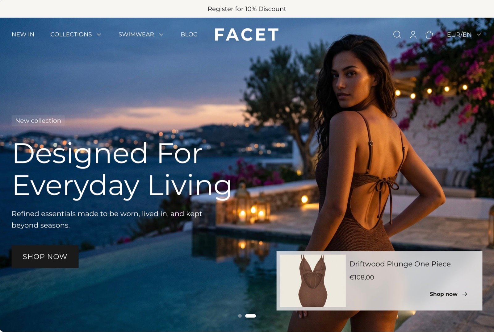
What this section controls
- The messages shown in the middle of the bar, each with an optional icon.
- How the messages move: one at a time with a fade, or as a continuous ticker.
- Up to two side links at the start or end of the bar.
- The social media icons at the start of the bar.
- The bar’s colors, padding and width.
Getting started
1
Open the Theme Customizer
In your Shopify admin, open Online Store, then Themes, and click Customize next to Facet.
2
Select the announcement bar
In the Sections panel on the left, click Announcement bar in the header group at the top. If it isn’t there, click Add section in the header group and choose Announcement bar. It can only be added to the header group.
3
Write your messages
Click a Message block to edit its text. Click Add block, then Message, to add another one.
4
Choose the motion
Click Announcement bar and pick Fade one by one or Continuous ticker.
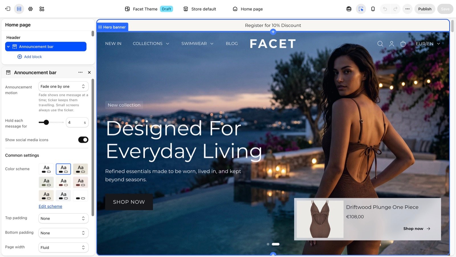
Section settings
Motion
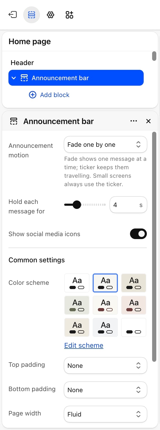
Announcement motion
Announcement motion
- Fade one by one (default): shows one message at a time and fades to the next.
- Continuous ticker: all messages travel across the bar in a loop.
Hold each message for
Hold each message for
How long each message stays before the next one fades in: from 2 to 10 seconds. Default: 4. Appears only when Announcement motion is Fade one by one.
Ticker pace
Ticker pace
How far the messages travel each second, in pixels: from 10 to 80. Default: 40. Higher values move faster. Appears only when Announcement motion is Continuous ticker.
Social media
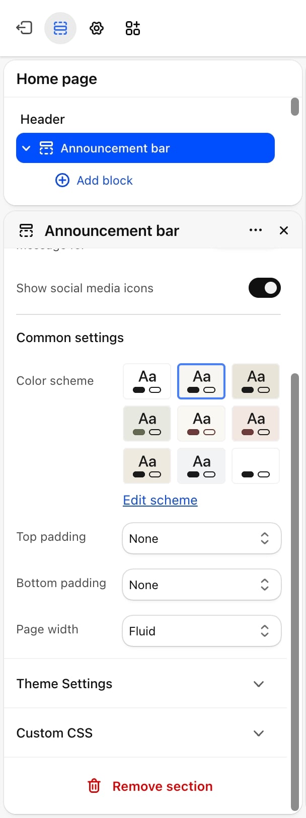
- Show social media icons: on by default. Shows your social media icons at the start of the bar. The icons come from the links in Social media, and nothing shows until you add at least one link there.
Common settings
- Color scheme: the colors of the bar.
- Top padding and Bottom padding: None (default), Small, Medium, Large or Extra large.
- Page width: Narrow, Narrower, Fluid (default) or Full.
Blocks
The announcement bar has its own two block types. They are not theme blocks and can’t be used in other sections.Message
A message in the middle of the bar. You can add up to 6.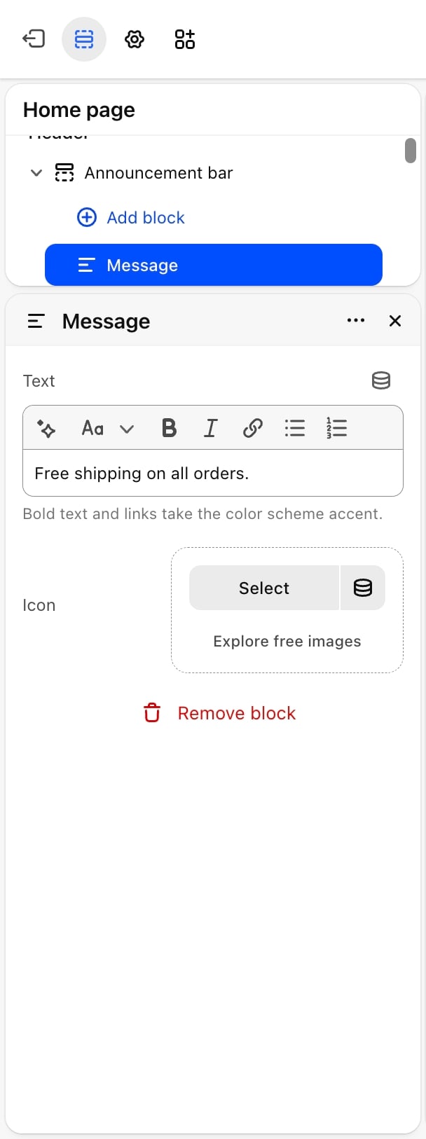
- Text: the message. Bold text and links take the Accent color of the bar’s color scheme, so you can highlight one word. A message with empty text is skipped.
- Icon: an optional small picture shown before the text, at 16 by 16 pixels.
Side link
A small link at the side of the bar, such as a link to your contact page or store locator. You can add up to 2.- Position: Start or End (default). Start links sit after the social media icons.
- Label: the link text.
- Link: where the link goes. Without one, it goes to your home page.
- Icon: an optional small picture shown before the label, at 16 by 16 pixels.
On phones the social media icons and side links are hidden, so the messages get the whole width.
Best practices
- Keep messages short. The bar is one line high. A short message such as “Free shipping over 150 euros” reads at a glance, even while it moves.
- Check the phone view. Phones always use the ticker and hide side links, so put anything important in a message, not only in a side link.
- Give the fade enough time. With longer messages, raise Hold each message for so shoppers can finish reading.
- Pick a contrasting color scheme. A bar that differs from the header color sets the messages apart.
Related guides
Header
Set up the menus, logo and search below the announcement bar.
Social media
Add the links behind the social media icons.