

What these settings control
- The page background and text color of every section.
- The colors of primary and secondary buttons, including their hover state.
- Borders and dividers, such as input outlines and lines between rows.
- Surfaces: the tinted backgrounds of form fields, tables and card frames.
- The accent color for keyboard focus outlines and small highlights.
How to access
1
Open the Theme Customizer
In your Shopify admin, open Online Store, then Themes, and click Customize next to Facet.
2
Open Theme settings
Click the Theme settings icon in the left sidebar.
3
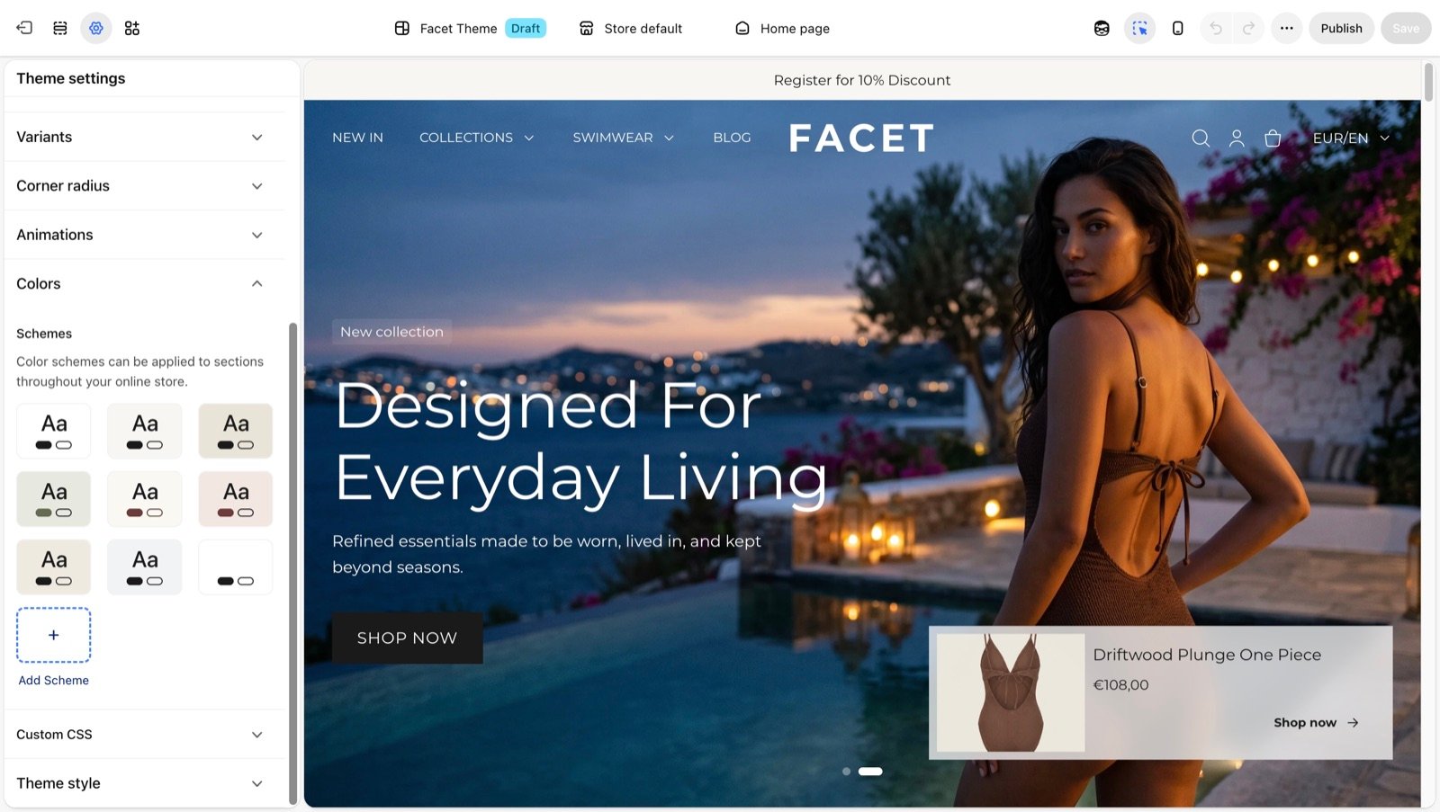
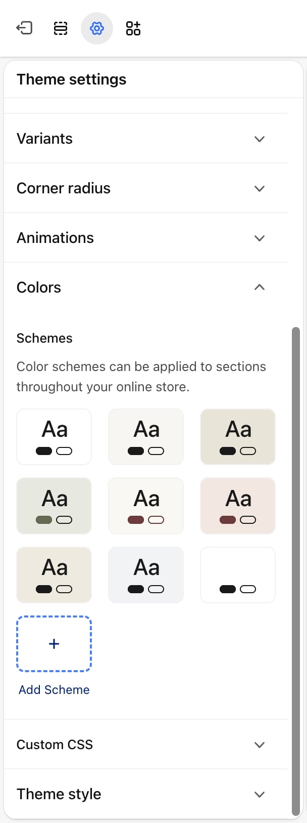
Open Colors
Expand Colors. Click a scheme to edit it, or click Add scheme to create a new one.
Scheme settings
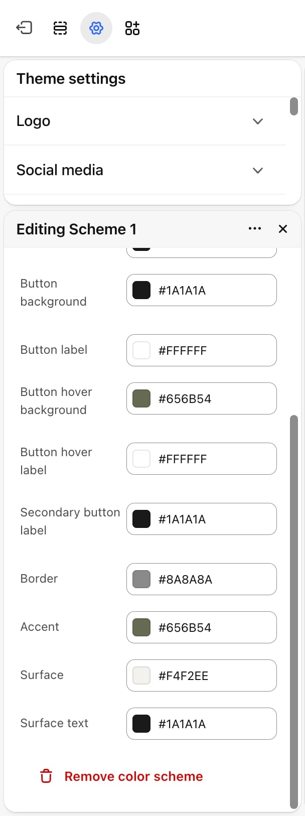
Each color scheme has the same set of colors.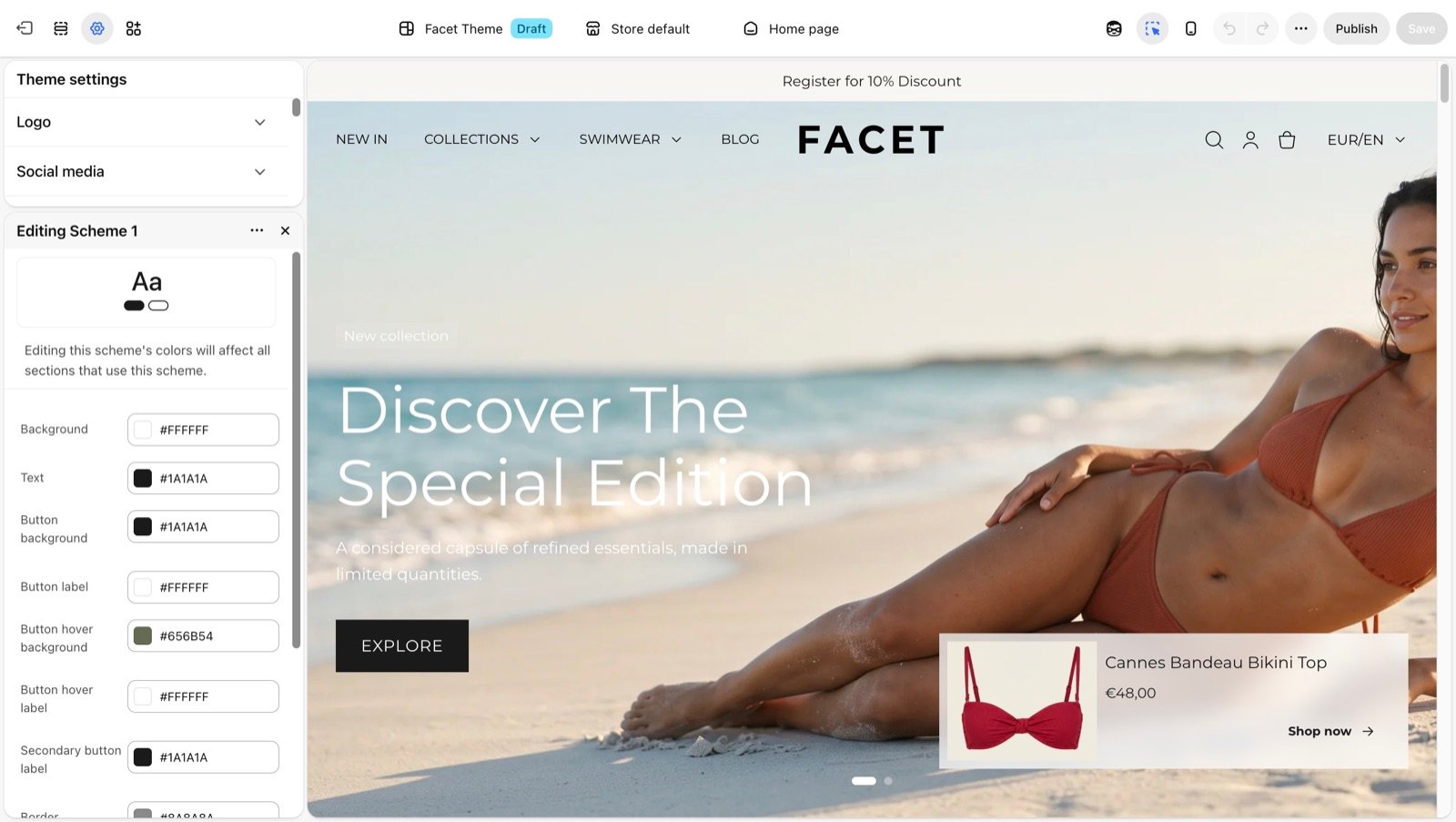
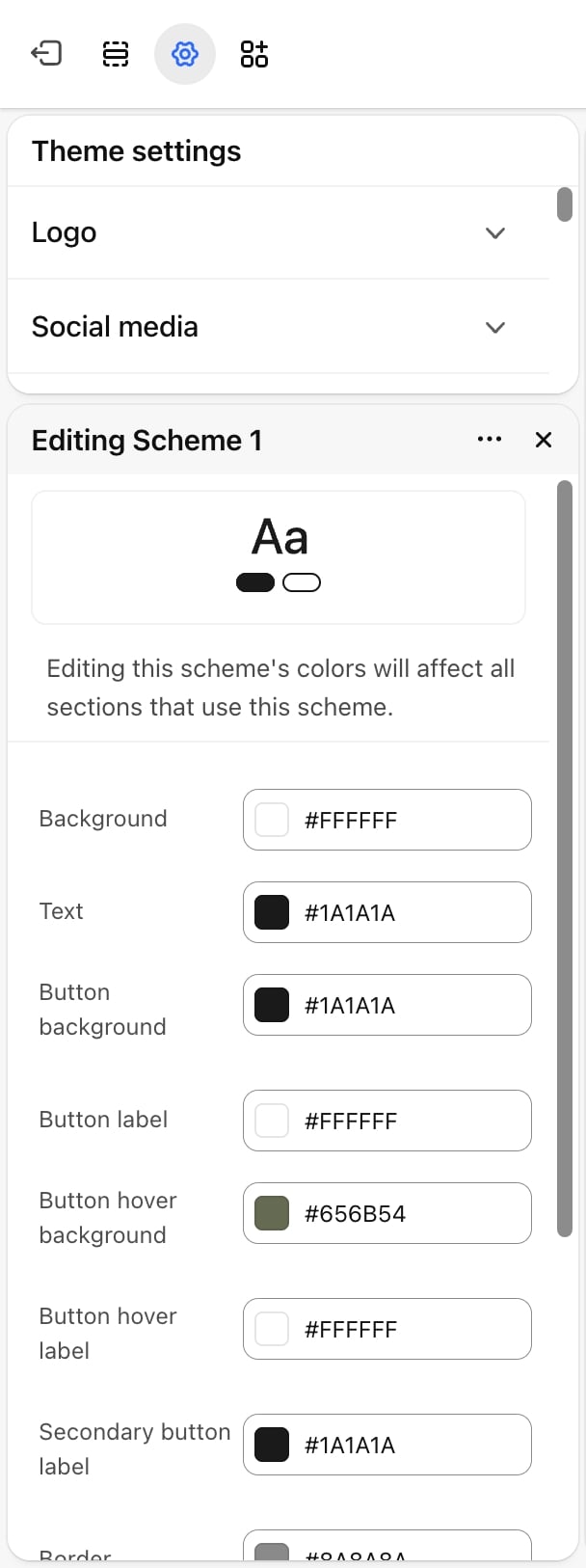
Background
Background
The background color of any section or block that uses this scheme. Default:
#F8F6F2.Text
Text
Body text, headings and icons. Default:
#1A1A1A.Border
Border
Dividers, input outlines and the borders around cards and panels. Default:
#808080.Accent
Accent
The outline that shows around buttons and links when a shopper moves through the page with the keyboard, the background of tertiary buttons, and the active dot on sliders. Default:
#656B54.Surface
Surface
Tinted areas inside a section: form fields and dropdowns, table headers, and the frames behind product and article pictures. Default:
#EAE4D8.Surface text
Surface text
Text shown on a surface, such as the text a shopper types into a form field. Default:
#1A1A1A.Apply a scheme
Most sections have a Color scheme setting under Common settings, and many blocks, such as slides and product cards, have their own. Pick the scheme you want for that section or block. The first scheme in the list is the store default: it colors the page itself and anything that has no scheme of its own.Some settings use a scheme for one part only. For example, the hero banner’s Dots color scheme colors only the slider dots, and the band behind them keeps the section’s scheme. The setting’s help text in the Theme Customizer says which part it colors.
Best practices
- Check contrast. Make sure Text reads clearly on Background, and Button label on Button background. Low contrast makes the store harder to use and to read on phones outdoors.
- Keep surfaces close to the background. A surface a few shades darker or lighter than the background frames content without competing with it.
- Edit, don’t duplicate. To change the look of every section that shares a scheme, edit that scheme instead of creating a new one.
- Give each scheme one role. A short list of schemes, such as one light, one tinted and one dark, is easier to keep consistent than one scheme per section.
Related guides
Header
Pick the header, search drawer and mega menu card schemes.
Hero banner
Give each slide, the dots and the arrows their own scheme.