

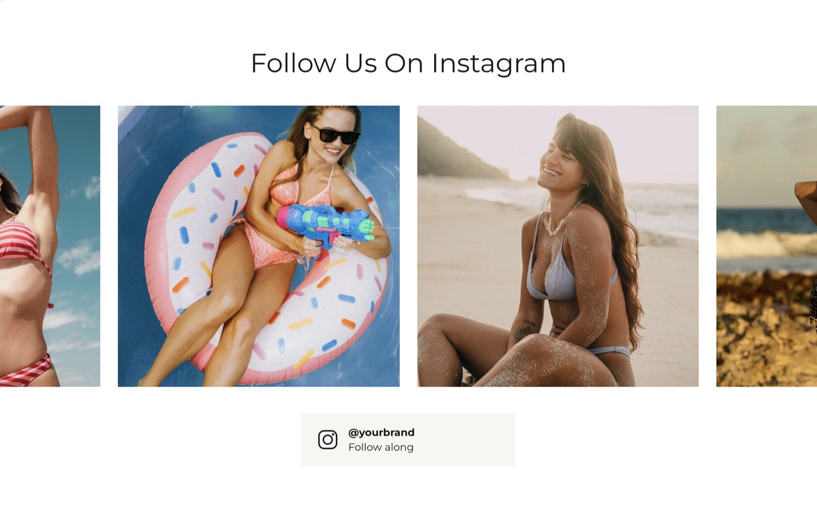
What this section controls
- A heading and text above the images.
- The slider of images: how many show, their shape and autoplay.
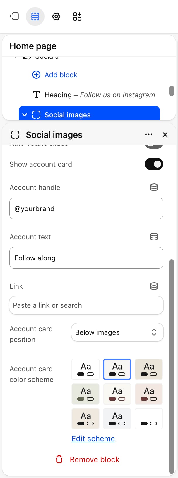
- The account card with your handle and a link to your profile.
Getting started
1
Open the Theme Customizer
In your Shopify admin, open Online Store, then Themes, and click Customize next to Facet.
2
Add the section
In the Sections panel, click Add section and choose Socials. It comes with a heading and a Social images block holding four Social image blocks. It can’t be added to the header.
3
Add your pictures
Click each Social image block, pick a picture and paste the link to the post.
4
Set your handle
Click Social images and change Account handle and Link to your own profile.
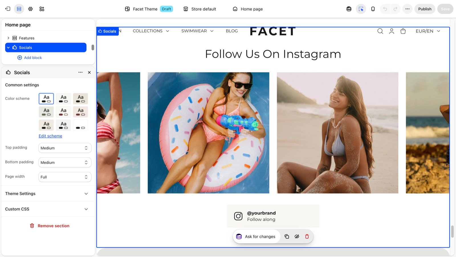
Section settings
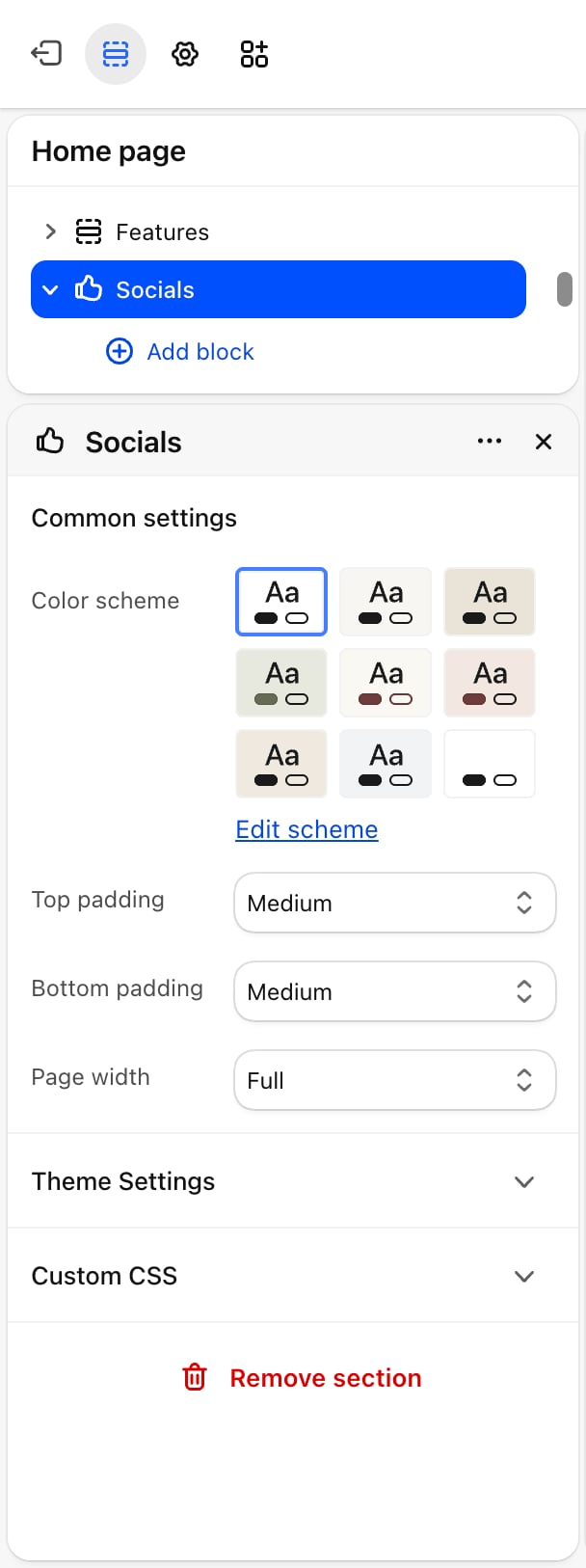
Common settings
- Color scheme: the colors of the section.
- Top padding and Bottom padding: None, Small, Medium (default), Large or Extra large.
- Page width: Narrow, Narrower, Fluid (default) or Full.
Blocks
The section accepts Heading and Text blocks. See Theme blocks for their settings.Social images
The slider and the account card. Shoppers drag or swipe through the images, or use the arrow keys.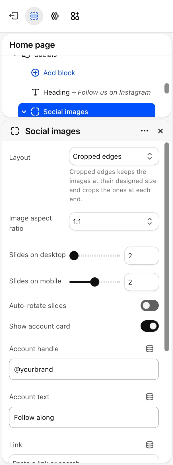
- Layout
- Autoplay
- Account card
- Layout: Fit to row (default) shows a set number of whole images across the row. Cropped edges keeps the images at their designed size, cuts off the images at each end of the row, and loops the slider so it never runs out.
- Image aspect ratio: 1:1 (default), 4:5, 3:4, 2:3, 5:4, 4:3 or 16:9.
- Slides on desktop: from 2 to 6. Default: 4.
- Slides on mobile: from 1 to 3. Default: 2.
Social image
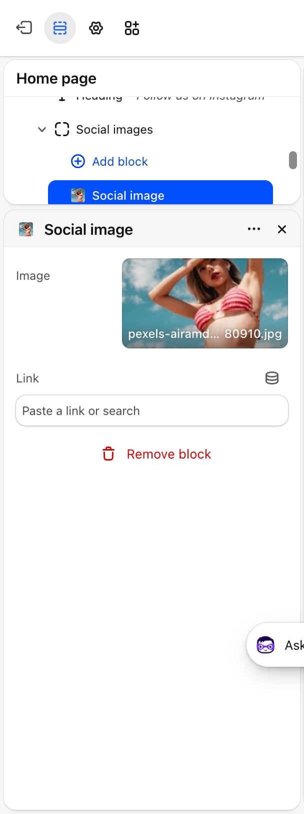
- Image: the picture. A placeholder shows until you pick one.
- Link: optional. Clicking the picture opens this address in a new tab.
Best practices
- Upload the pictures in the shape you choose. Pictures are cropped to the Image aspect ratio, so square posts suit 1:1 and portrait posts suit 4:5.
- Link each picture to its post. Shoppers who tap a picture expect to see that post, not just your profile.
- Add more images than fit on screen. The slider only moves when there are more images than Slides on desktop or Slides on mobile.
- Replace the placeholder handle. The card shows “@yourbrand” until you change it.
Related guides
Social media
Add the profile links used for social icons across the theme.
Theme blocks
Settings for the heading and text blocks above the slider.