

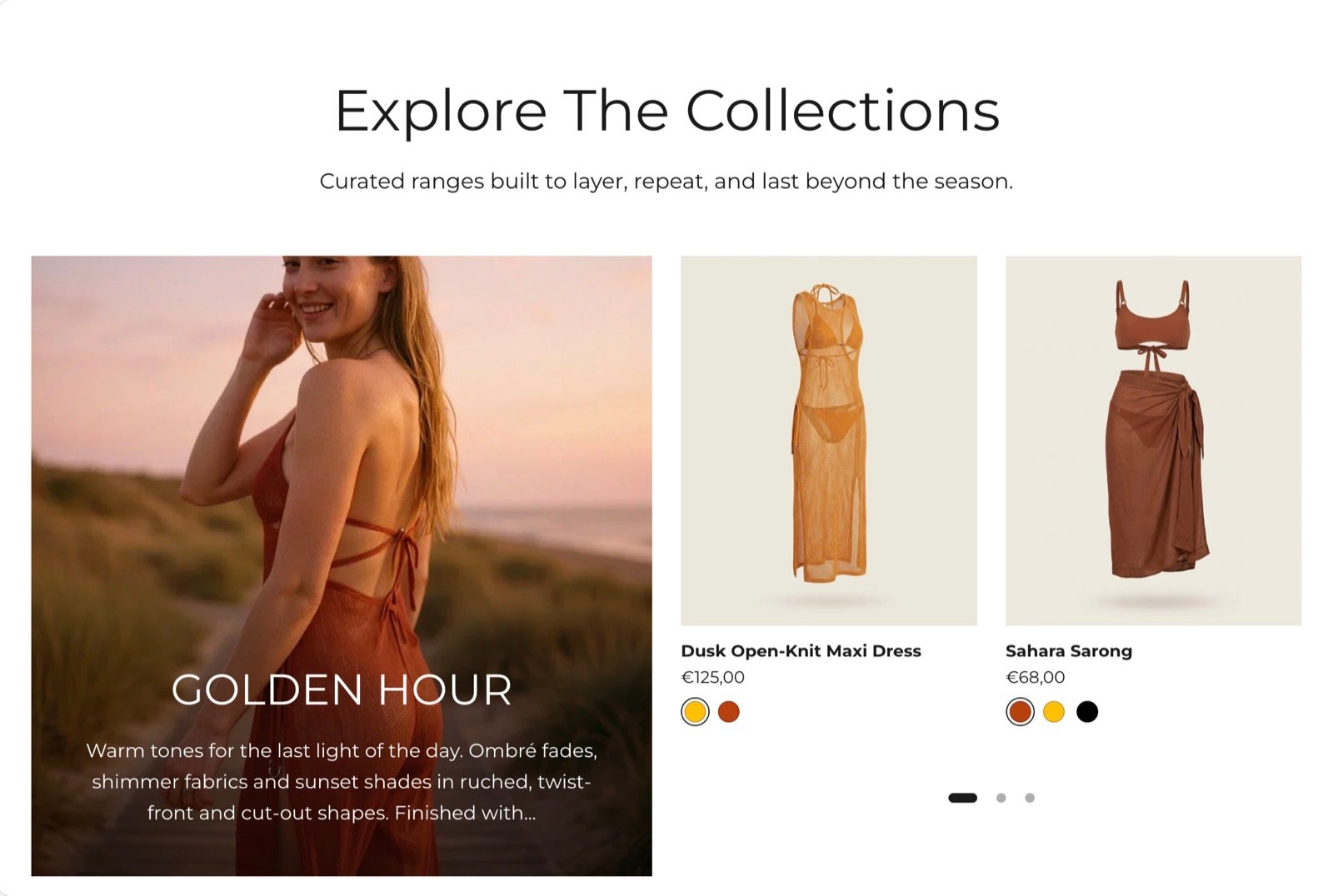
What this section controls
- The collection whose products are shown, and how many.
- A grid or a carousel layout, and the number of columns on large screens.
- The carousel arrows and dots.
- An optional collection card with a picture, heading, text and button.
Getting started
1
Open the Theme Customizer
In your Shopify admin, open Online Store, then Themes, and click Customize next to Facet.
2
Add the section
In the Sections panel, click Add section and choose Featured collection. The section can’t be added to the header or footer.
3
Pick a collection
Click Featured collection, then click Collection and choose one from the collection picker.
4
Choose the layout
Set Products to show, Layout and Desktop columns.
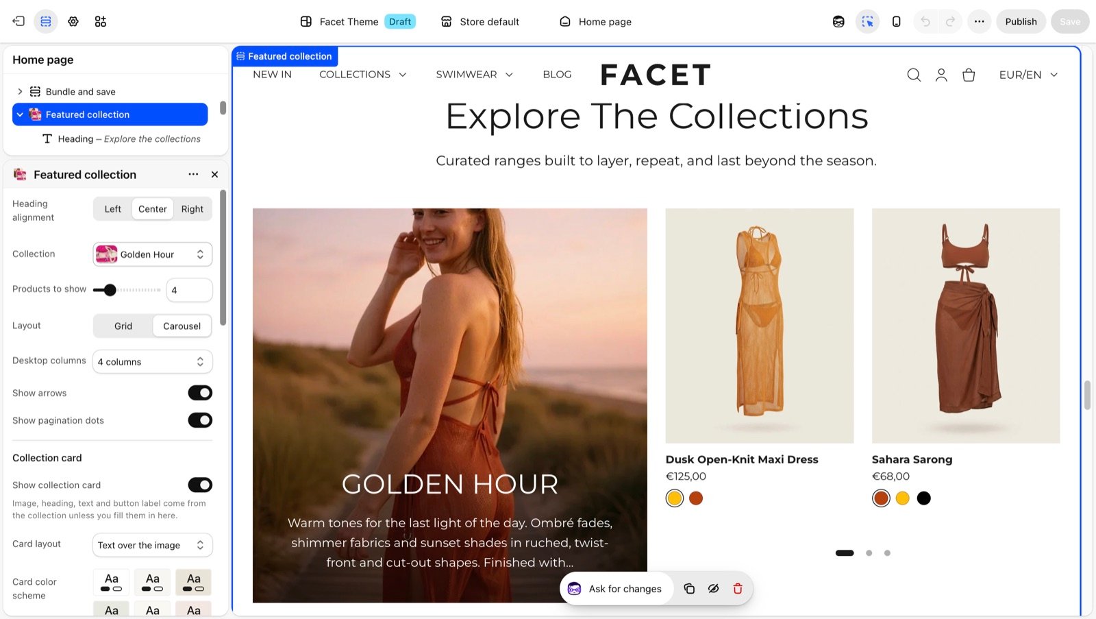
Section settings
Products
Heading alignment
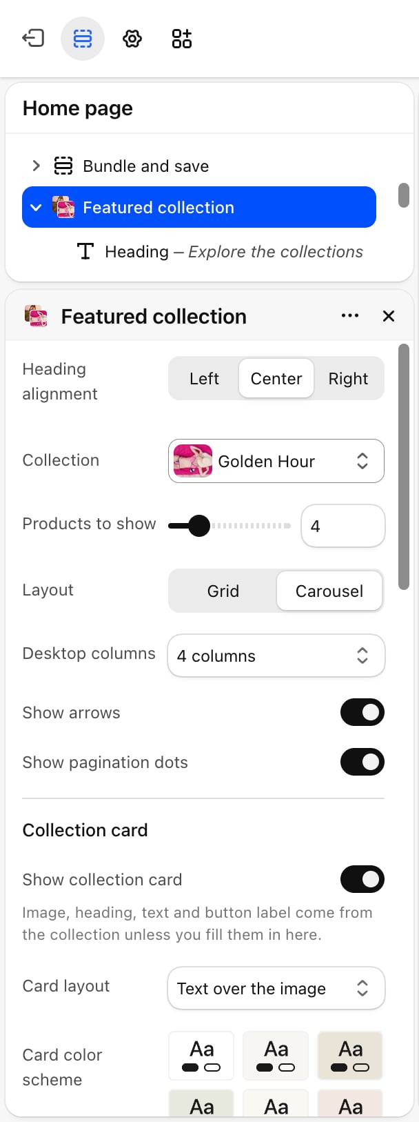
Heading alignment
The alignment of the intro heading and text: Left (default), Center or Right.
Collection
Collection
The collection to show, chosen with Shopify’s collection picker. Products appear in the collection’s own sort order, each with a quick add button. Until you pick a collection, the section shows four placeholder product cards.
Products to show
Products to show
The most products to show from the collection: from 2 to 12. Default: 4.
Layout
Layout
- Grid (default): products sit in rows.
- Carousel: products sit in one row that shoppers scroll sideways.
Desktop columns
Desktop columns
How many columns the products use on screens 750 pixels wide and larger: 2 columns, 3 columns or 4 columns (default). Phones show 2 products per row in the grid.
- Show arrows: on by default. Shows previous and next buttons beside the heading. Appears only when Layout is Carousel.
- Show pagination dots: on by default. Shows dots under the carousel. Appears only when Layout is Carousel.
Collection card
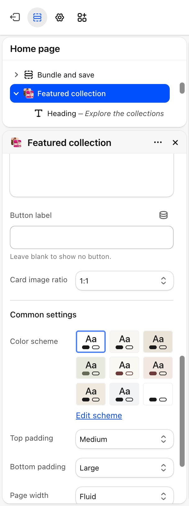
Show collection card
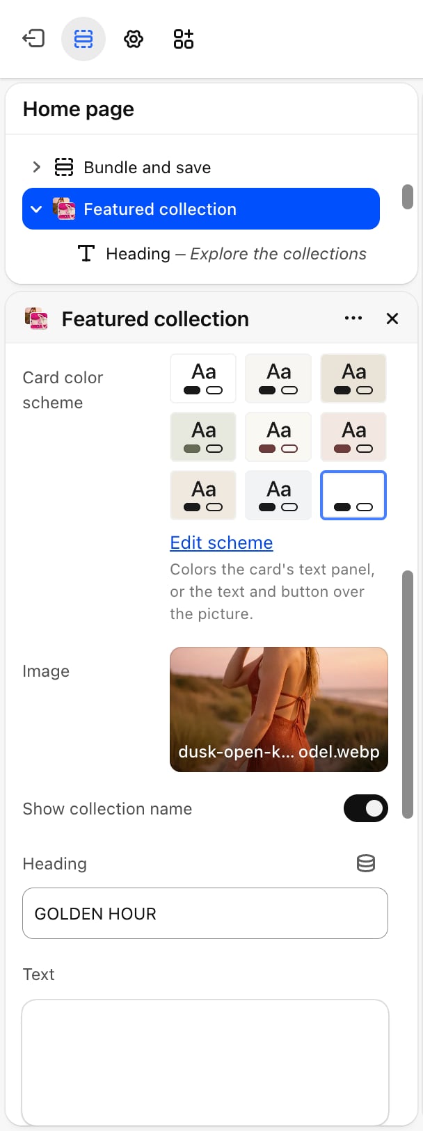
Show collection card
Off by default. Turn it on to show the card. The other card settings appear only when it is on. With 4 columns, the card takes the space of two products. With 2 or 3 columns, it takes the space of one.
Card layout
Card layout
Image above the text (default) or Text over the image.
Card color scheme
Card color scheme
Colors the card’s text panel, or the text and button over the picture.
Image
Image
The card picture. Leave it empty to use the collection’s image. Without either, a placeholder shows.
Show collection name and Heading
Show collection name and Heading
Show collection name is on by default and shows a heading on the card. Heading replaces the collection name with your own text. It appears only when Show collection name is on.
Text
Text
A short text on the card. Leave it empty to use the start of the collection description, about 24 words.
Card image ratio
Card image ratio
The shape of the card picture: 1:1 (default), 4:5, 3:4, 2:3, 5:4, 4:3 or 16:9.
Common settings
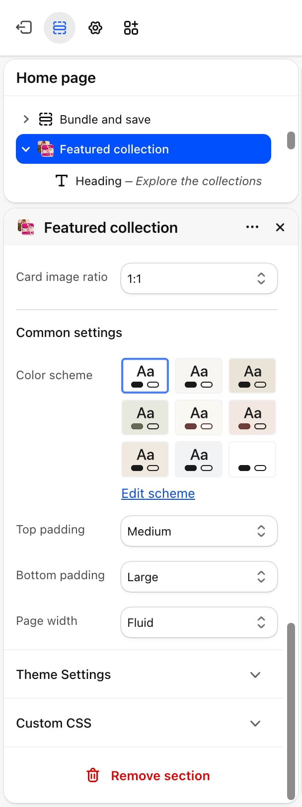
- Color scheme: the colors of the section.
- Top padding and Bottom padding: None, Small, Medium, Large (default) or Extra large.
- Page width: Narrow, Narrower, Fluid (default) or Full.
Blocks
Intro heading and text
The section has a fixed Heading and Text block above the products. Their settings are described on Theme blocks.Best practices
- Show a full row. Set Products to show to a multiple of Desktop columns, such as 4 or 8 with 4 columns, so the last row isn’t half empty.
- Use the carousel for long lists. Above 8 products, a carousel keeps the section short.
- Write a card text. A collection description written for the collection page is often too long for the card. A sentence typed in Text reads better.
Related guides
Product cards
Change how the product cards in this section look.
Tabbed collections
Show several collections in one section with tabs.