

What these settings control
- Inputs: text fields, dropdowns and text areas, such as search, newsletter sign-up, contact and login forms, cart notes and quantity selectors.
- Cards: product card pictures, collection cards, pictures in Image blocks and image sections, testimonial and story cards, mosaic tiles, popups and other framed panels.
How to access
1
Open the Theme Customizer
In your Shopify admin, open Online Store, then Themes, and click Customize next to Facet.
2
Open Theme settings
Click the Theme settings icon in the left sidebar.
3
Open Corner radius
Expand Corner radius.
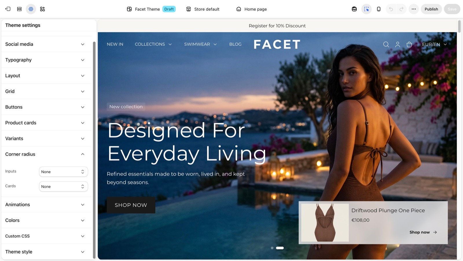
Corner radius settings
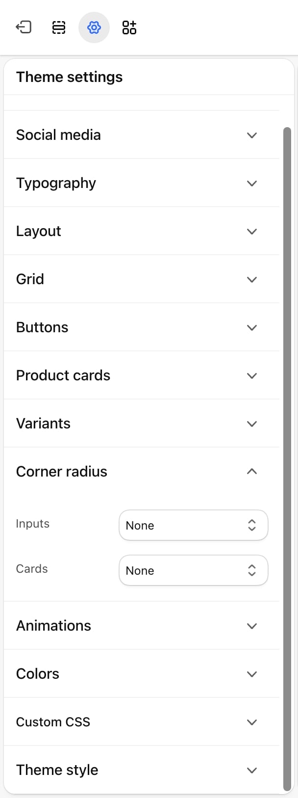
Inputs
Inputs
- None: square corners.
- Extra small: 4 pixels.
- Small: 8 pixels.
- Medium (default): 10 pixels.
- Large: 12 pixels.
- Extra large: 16 pixels.
- Pill: fully rounded ends.
Cards
Cards
- None: square corners.
- Extra small: 4 pixels.
- Small: 8 pixels.
- Medium: 10 pixels.
- Large (default): 12 pixels.
- Extra large: 16 pixels.
Best practices
- Keep one family of shapes. Pair None here with None buttons, or soft corners with Soft rounded buttons. Mixing square cards with pill buttons rarely looks intended.
- Use Pill inputs with Rounded buttons. A pill search field next to a pill button reads as one control.
- Check pictures with borders. With Show card borders on in Product cards, the card border uses the Cards radius too.
Related guides
Buttons
Set the corner style of every button.
Variants
Set the shape of option boxes and swatches.