


What this section controls
- The layout: text over the picture, or text in a panel beside it.
- The banner height on large screens.
- Autoplay, the time between slides, and the transition speed.
- The slider dots and arrows.
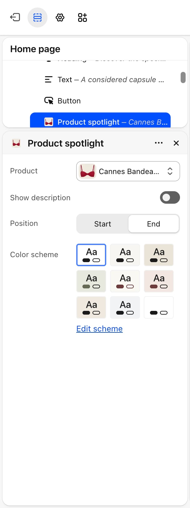
- The style of the product card shown on a slide.
- The header colors when a transparent header sits over the banner.
Getting started
1
Open the Theme Customizer
In your Shopify admin, open Online Store, then Themes, and click Customize next to Facet.
2
Add the section
In the Sections panel, click Add section and choose Hero banner. The hero banner can’t be added to the header.
3
Set up each slide
Click a Slide block to pick its picture and edit its text and buttons. Click Add block, then Slide, to add another slide.
4
Tune the slideshow
Click Hero banner to choose the layout, height and autoplay settings.
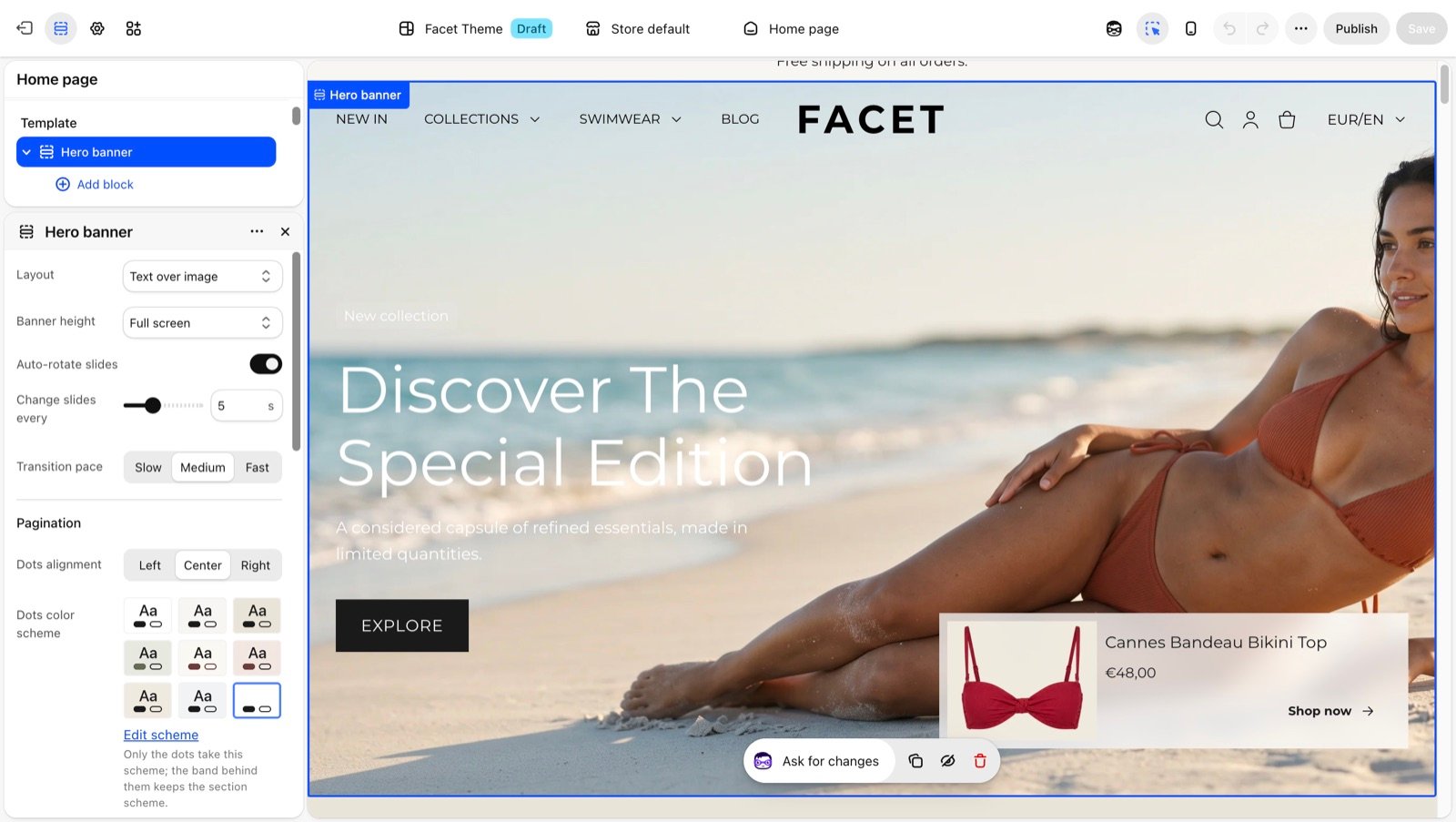
Section settings
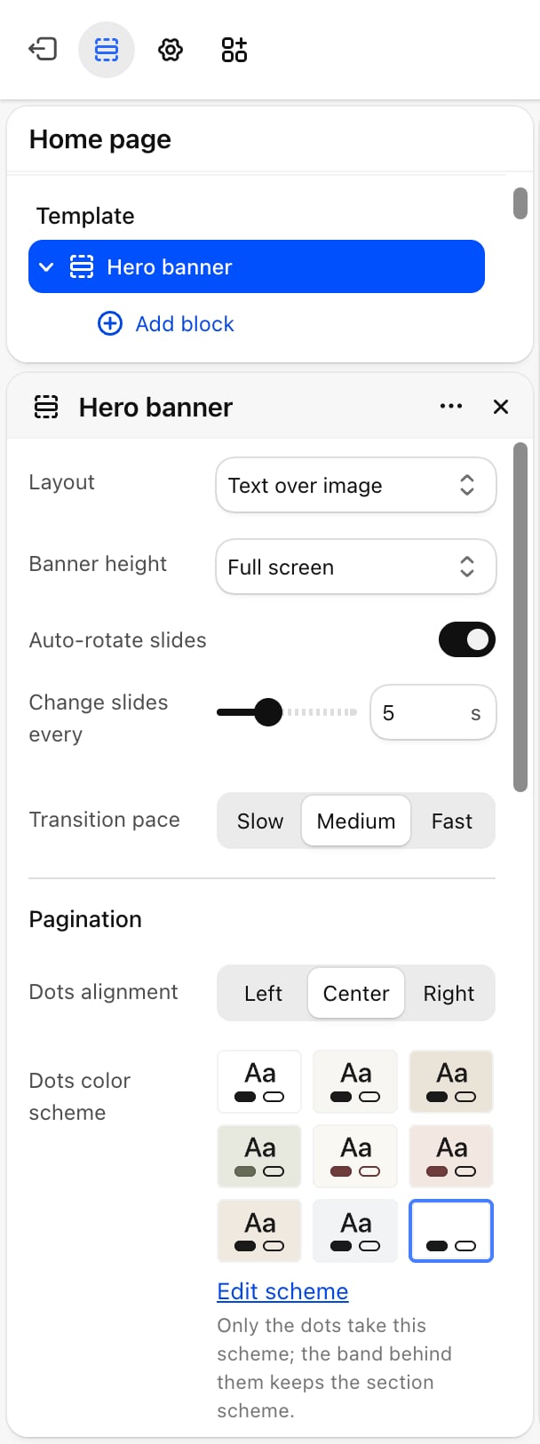
Layout
Layout
Layout
- Text over image (default): the slide text sits on top of the picture.
- Side by side: the text sits in a colored panel next to the picture. A scrolling line of text can run along the bottom of the banner in this layout.
Image position
Image position
Right (default) or Left. Appears only when Layout is Side by side.
Slider
- Auto-rotate slides: off by default. Moves to the next slide on its own.
- Change slides every: from 3 to 9 seconds. Default: 5. Appears only when Auto-rotate slides is on.
- Transition pace: Slow, Medium (default) or Fast.
Pagination and arrows
In the Side by side layout, the dots are hidden and previous and next arrows always show over the picture, so the settings below appear only when Layout is Text over image.- Dots alignment: Left, Center (default) or Right. The dots are hidden when the banner has one slide. Appears only when Layout is Text over image.
- Dots color scheme: colors only the dots. The band behind them keeps the section’s color scheme. Appears only when Layout is Text over image.
- Show arrows: off by default. Shows round previous and next buttons over the slides. Appears only when Layout is Text over image.
- Arrows color scheme: colors the arrow buttons. Appears only when Show arrows is on.
Product card
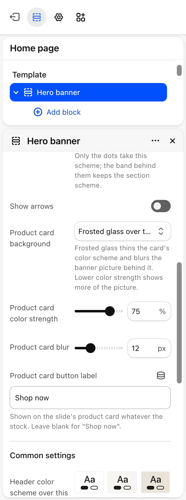
- Product card background: Frosted glass over the picture (default) thins the card’s color scheme and blurs the picture behind it. Solid color scheme fills the card with its color scheme.
- Product card color strength: from 20% to 90%. Default: 35%. Lower values show more of the picture. Appears only with the frosted background.
- Product card blur: from 4 to 32 pixels. Default: 12. Appears only with the frosted background.
- Product card button label: the button text on every slide’s product card. Leave it blank for “Shop now”.
Common settings
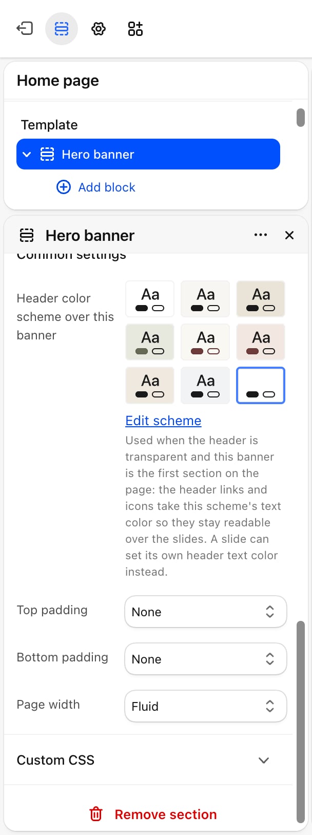
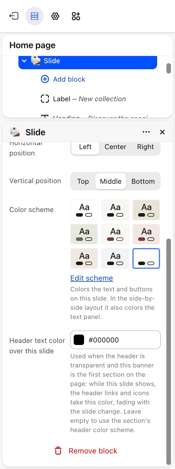
- Header color scheme over this banner: used when the header is transparent and this banner is the first section on the page. The header links and icons take this scheme’s text color so they stay readable over the slides.
- Top padding and Bottom padding: None (default), Small, Medium, Large or Extra large.
- Page width: Narrow, Narrower, Fluid (default) or Full.
Blocks
Slide
Each slide is a block. Add as many as you need and drag them to change their order.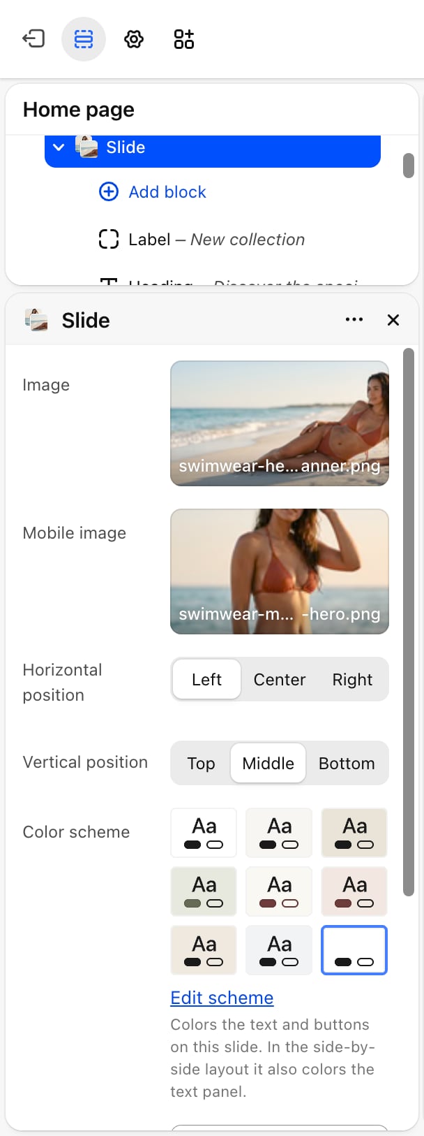
- Picture
- Text position
- Colors
- Nested blocks
- Image: the slide picture.
- Mobile image: an optional picture for phones, for example a portrait crop. Without one, phones show Image.
Scrolling line
In the side by side layout, the banner has a Scrolling line block along its foot. It shows nothing until you add text.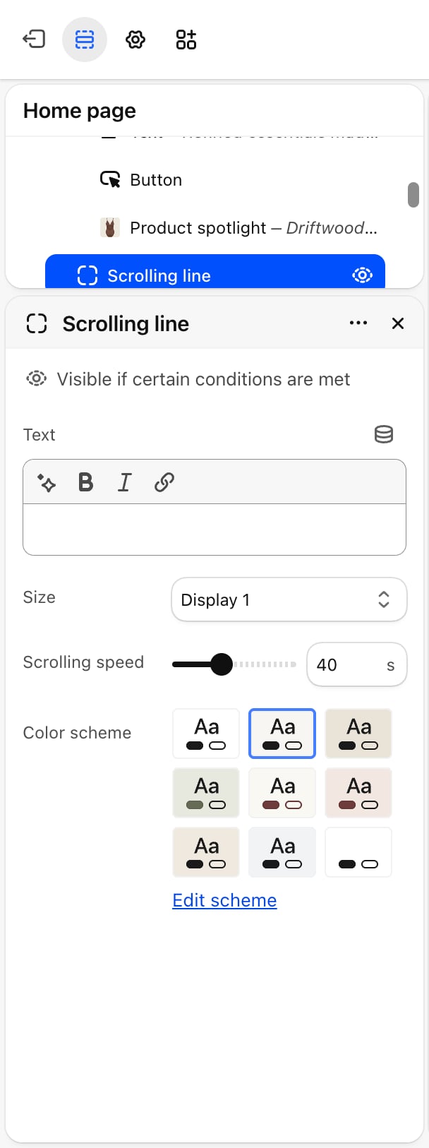
- Text: the text that scrolls.
- Size: Display 1 (default), Display 2, Heading 1 or Heading 2.
- Scrolling speed: from 10 to 90 seconds per loop. Default: 40. Higher values scroll more slowly.
- Color scheme: the colors of the line.
Best practices
- Add a mobile image. A wide desktop picture often loses its subject on a phone. A portrait crop keeps it in view.
- Give shoppers time to read. With auto-rotate on, pick at least 5 seconds per slide when slides carry several lines of text.
- Check contrast on every slide. Text over a busy picture is easier to read with a slide color scheme whose text color stands out from the picture.
Related guides
Header
Turn on the transparent header that sits over this banner.
Colors
Create the color schemes used by slides, dots and arrows.